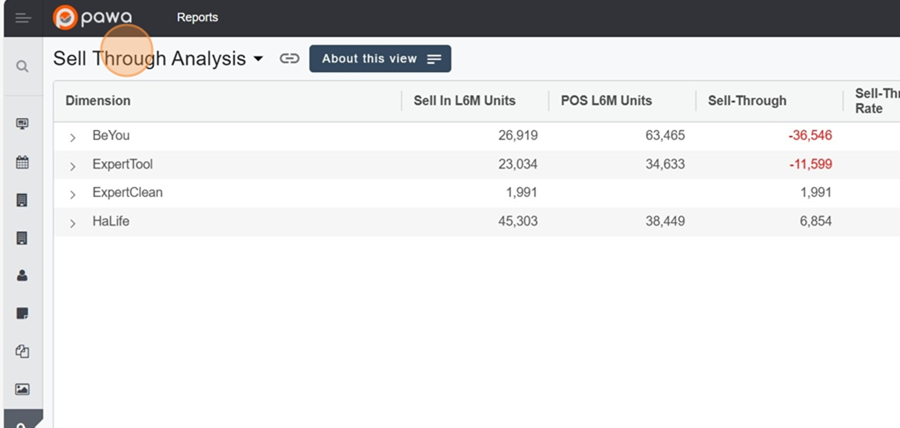
You'll find the view title at the top right. You can change it to see a different report.
View display and settings > Change the view title
Click on the report title
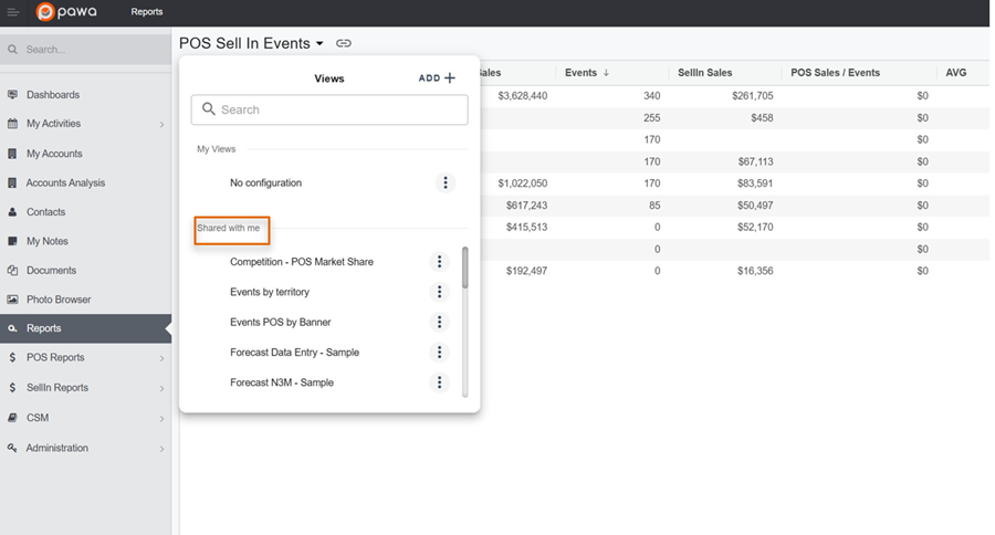
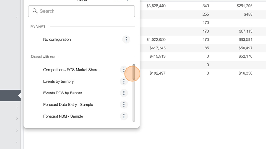
You’ll see 2 categories of views in the dropdown menu;
My views: these are your saved views
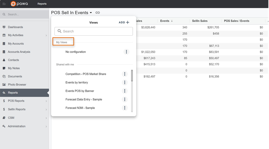
Shared with me: which represent the shared views
For more info about view types, check out this article:
Set up a view in Pawa
This page explains the view setup options in Pawa
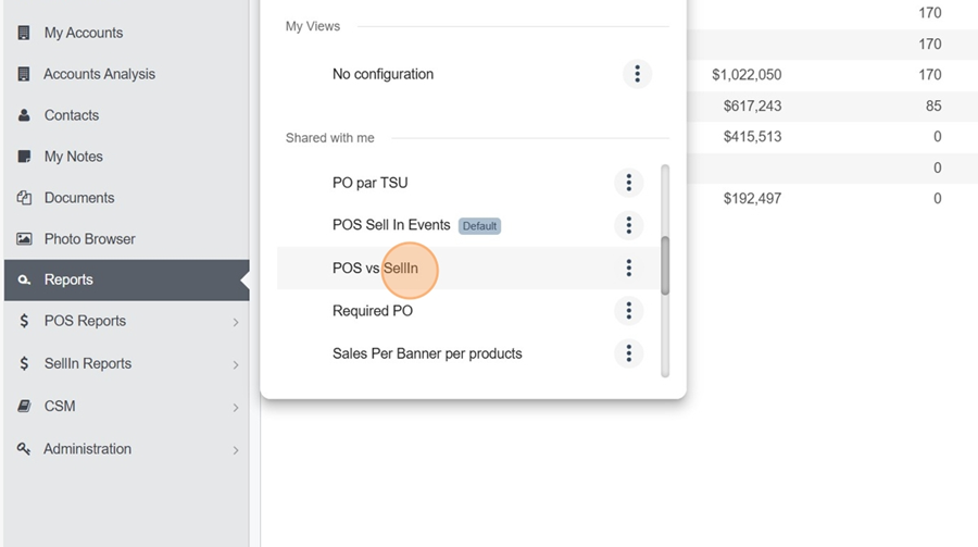
Next, look for the view you want using the selector
Click on the report you want to view
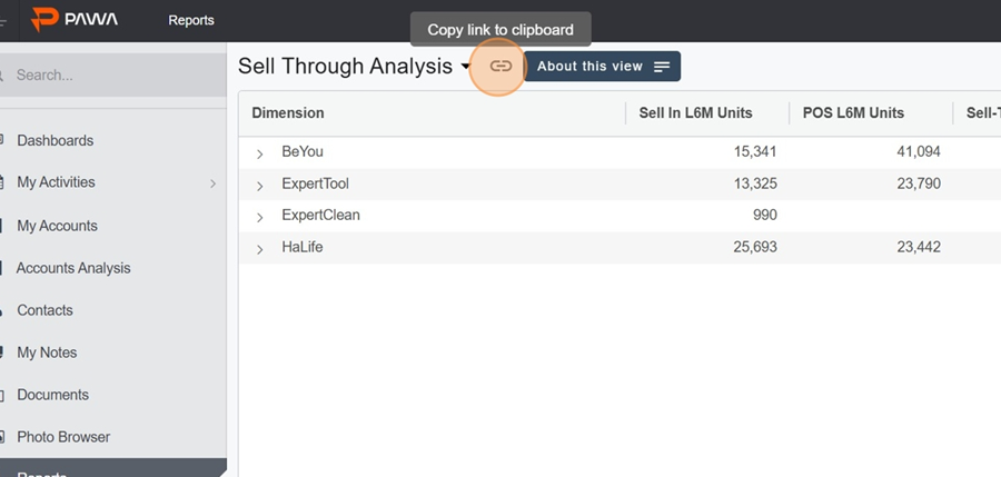
You can copy the view link to share it. Just click the icon on the right of the view title.

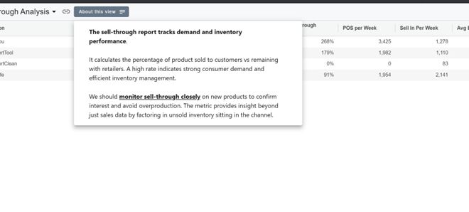
The About this view button lets you check out the description written by the creator. This helps you, for example, better understand the purpose of the columns in the report, the reason behind the report, and so on.
Click the About this view button
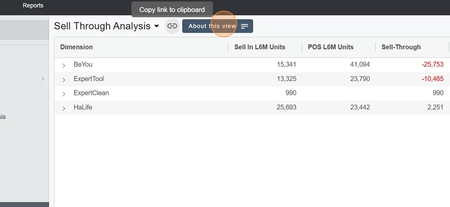
Check out the description content
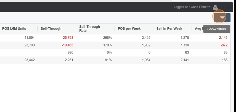
The filter button, up at the top right, shows a new information section about the report. It lets you check out:
The reference date
The dimensions and filters (blue and gray chips)
When the data was last updated
The data source health
Click the filter button at the top right of the view
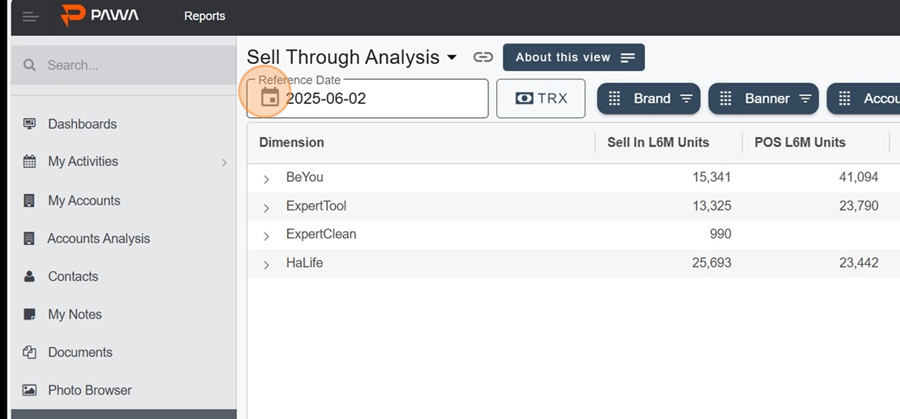
It’s important to understand that all sales shown in the report (POS, Sell-Through, Sell-in, etc.) are calculated based on the last 6 months from the reference date shown at the top left.
View filters > Reference date
To change the date, just click on the calendar icon and select the date you want.
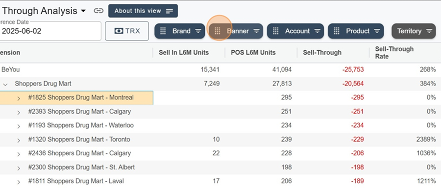
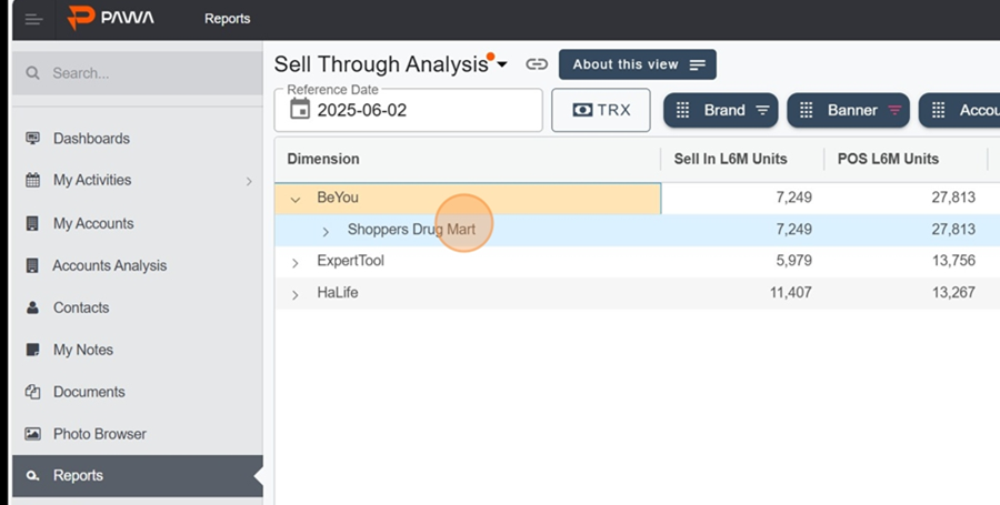
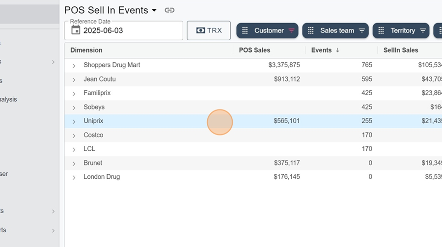
The blue chips at the top of the view show the visible dimensions. They’re placed from left to right based on the order the info is grouped.

For example, the first visible category is the Brand
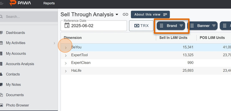
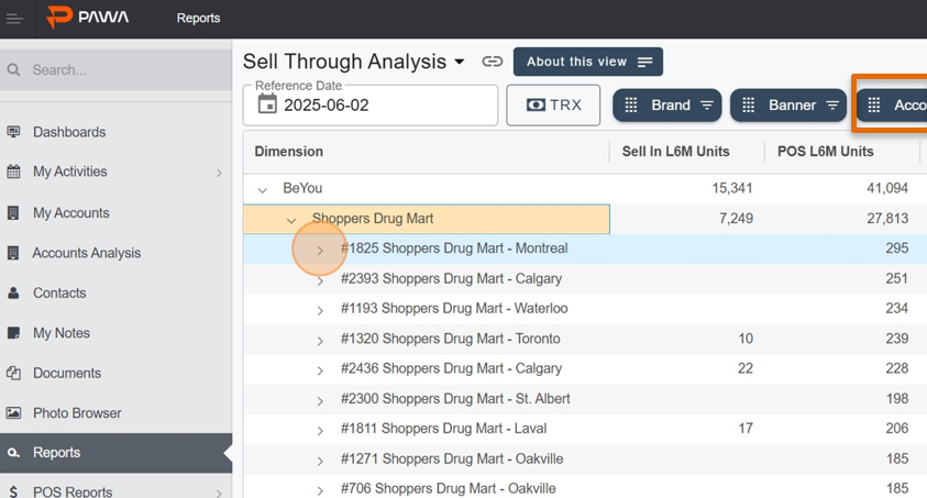
By clicking on the icon >, located all the way to the left of the row, you’ll see the next dimension open up (still from left to right); In this case, the Banner
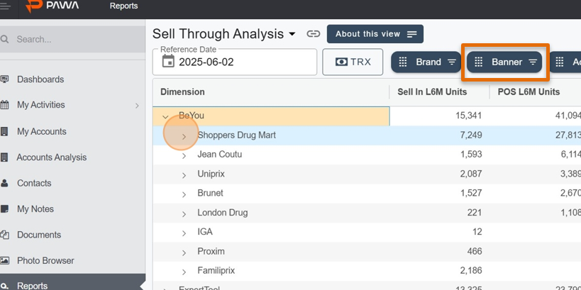
And so on
You can also just click directly on the blue pills to apply a filter. For example, let’s say we only want to see the Shoppers.
Click on the grid icon, to the left of the blue Banner
Type the category you’re looking for in the search bar
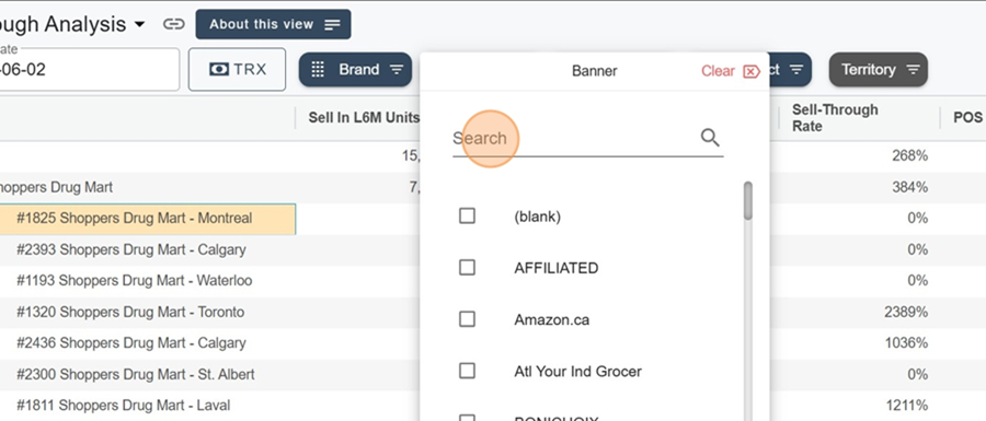
Select the filter you want
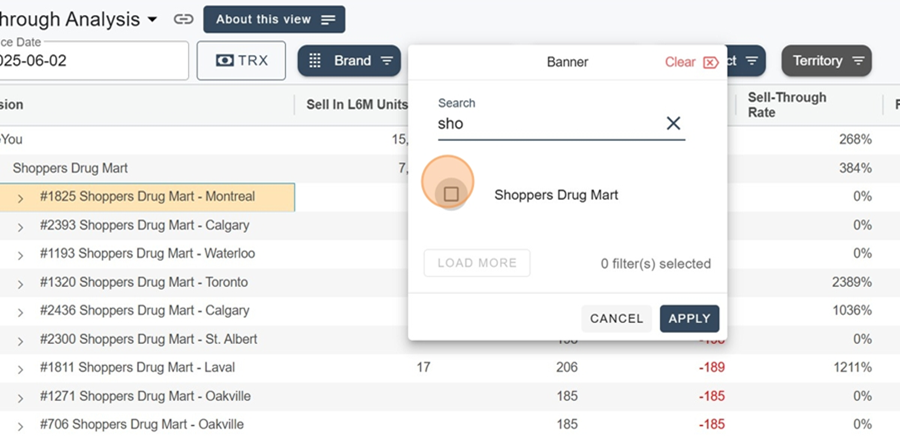
Click Apply, bottom right.
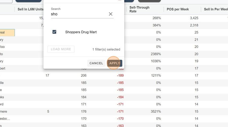
The numbers will automatically refresh based on the filter applied. For example, when you deploy a Brand, only the numbers related to Shoppers will be shown.
Grey chips represent the filters.
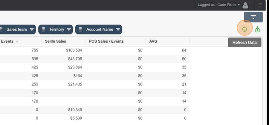
The refresh arrow icon at the top right lets you update the data, in case there’s been a data load since the last time you checked the report.
View filters > Refresh the data
Click on the rotating arrows icon at the top right to access the latest version of the data
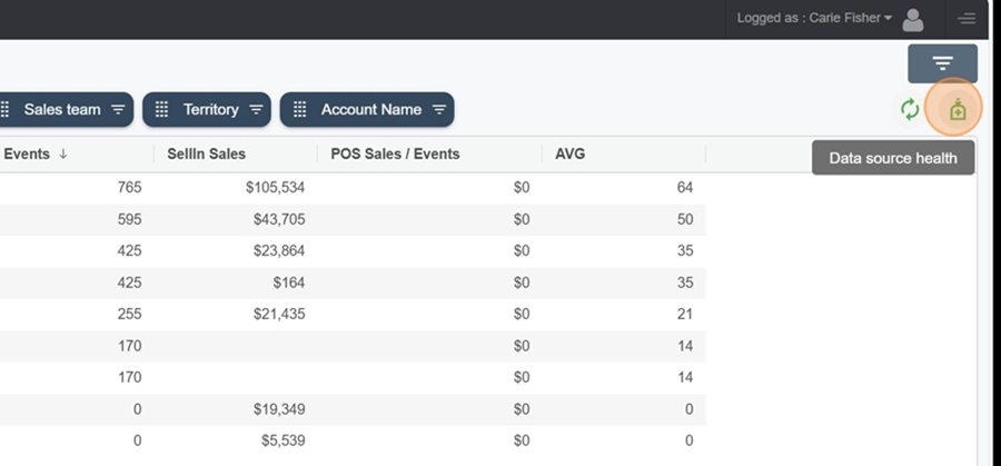
By clicking the green icon all the way to the right, at the top of the view, you'll be able to check the last time a data source was imported. This function is handy to make sure the data you see is up to date.
For more information on data source health, check out this article.
How to Use the Data Health Monitor
Explanation of the Data Source Health Monitor Page
View filters > Data source health
Click the green icon to the right of the rotating green arrows to check the latest data source imports.
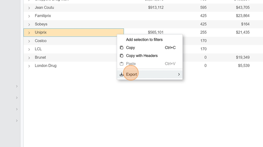
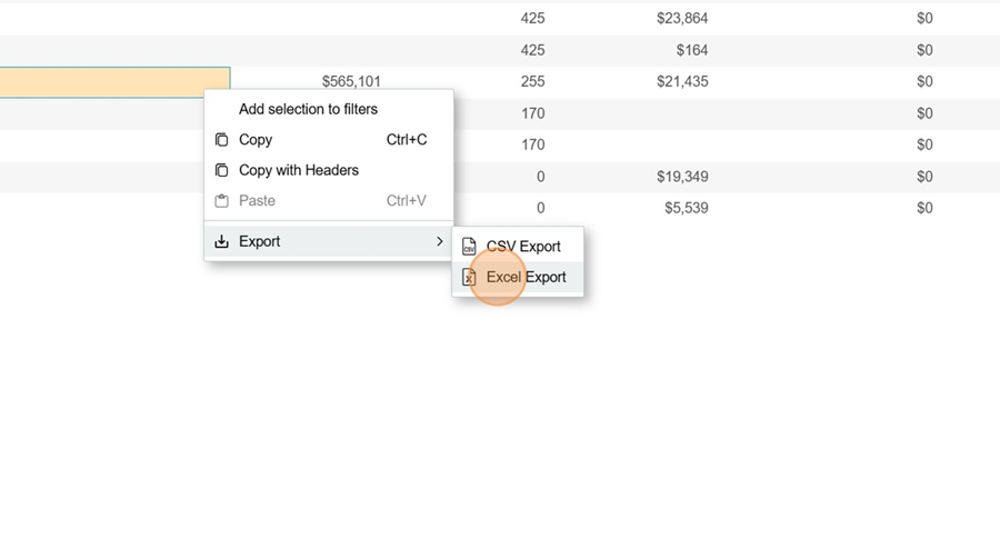
Here’s how to export the report to Excel.
Right-click on one of the rows in the report
Select the Export option
Click Excel Export to export it into Excel
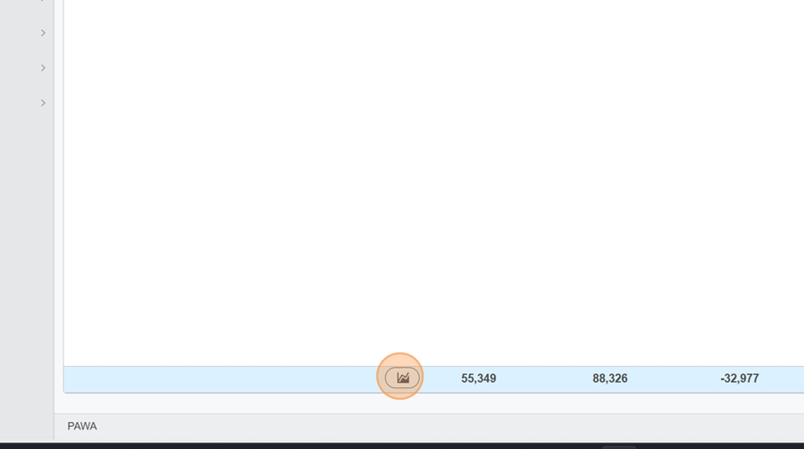
Depending on how the report is set up, you can view a sales chart.
Click on the chart icon in the row you want to check out
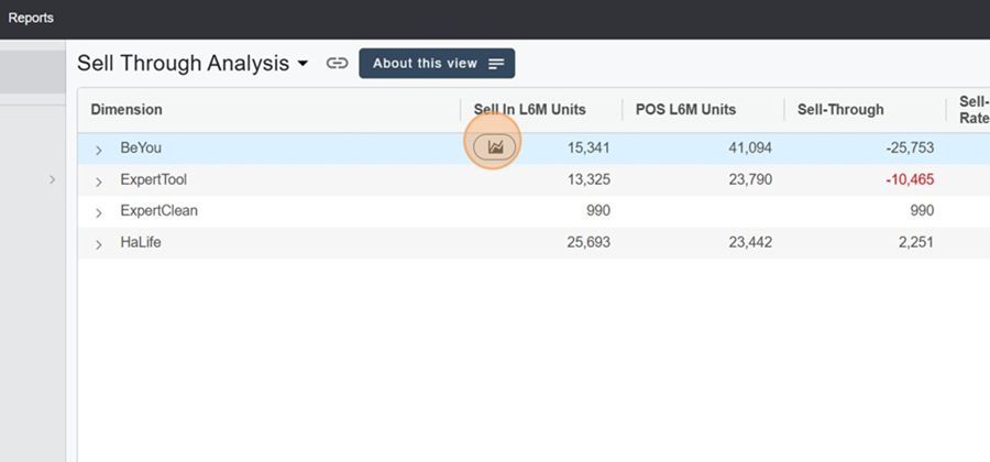
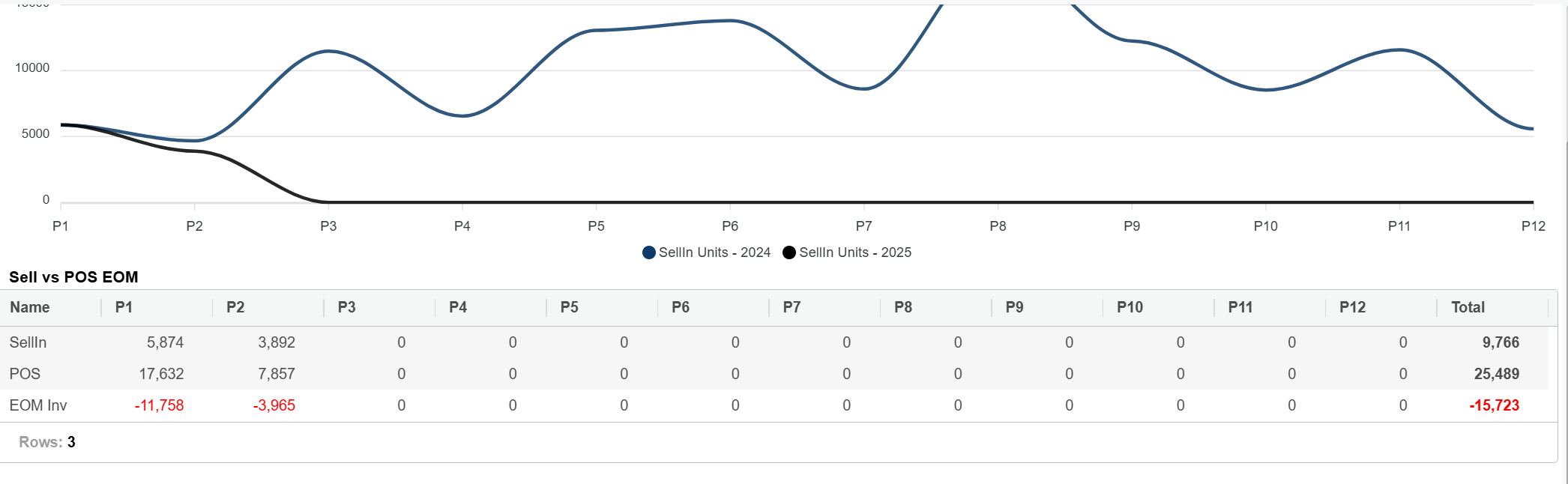
You’ll then see the chart for the category you clicked on
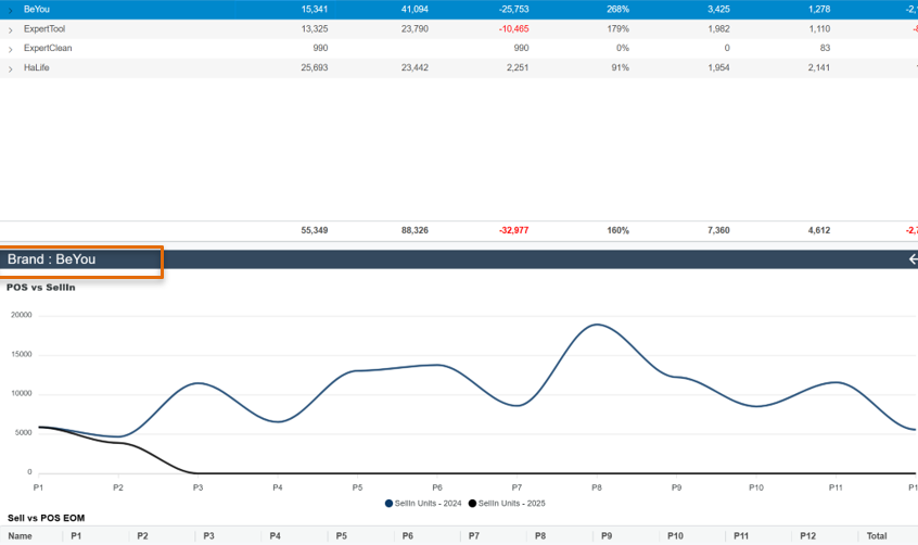
You can also check out a table showing the Sellin and POs sales figures, month by month, when you scroll down the image with your cursor
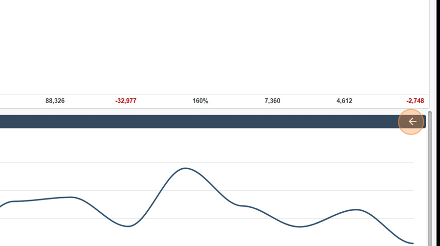
To close this element, just click the arrow at the top right of the chart
To see total sales in the chart, click the same icon—this time it's on the total row, all the way at the bottom