Metric reports in Pawa allow you to build sales reports, analyze forecast performance, compare time periods, and track key business indicators through fully customizable views.
This article focuses on the fundamentals of report creation. It covers the essential building blocks: creating a report, selecting dimensions, adding measures, configuring timeframes, and saving views. The goal is to give you the core knowledge needed to build your first reports, before moving on to more advanced analyses.
Initial setup > Create the report
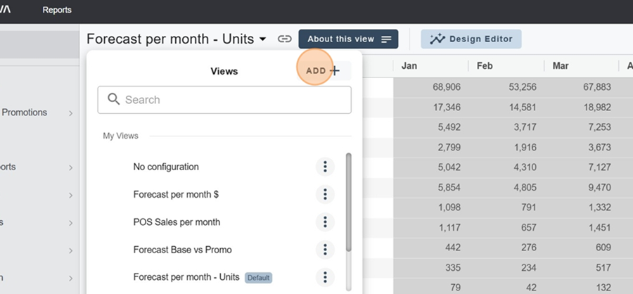
To create the report, first click on the title at the top left
Then click on ADD, at the top right of the box that appears
Initial setup > Title
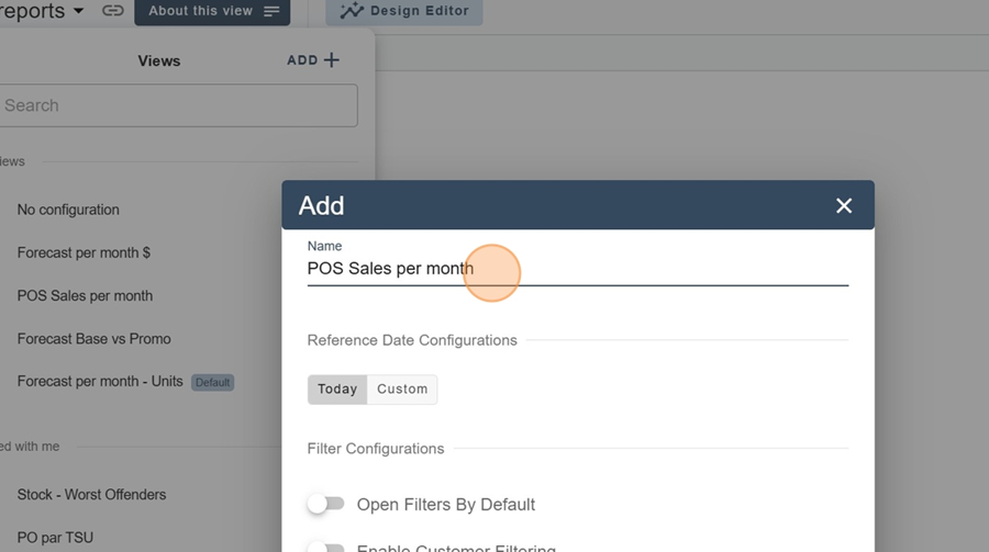
Type the title of your report in the top bar
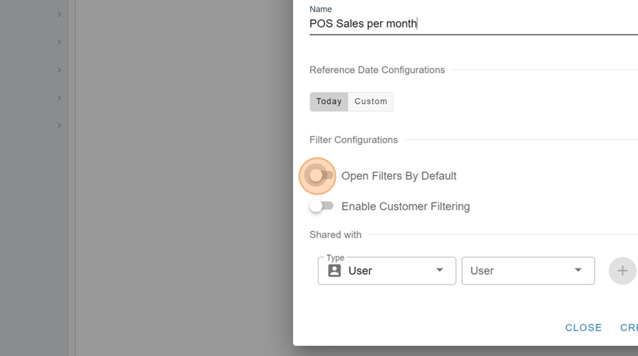
Initial setup > Filter settings
Check the filters you want (for example, if you want the filters to be open by default)
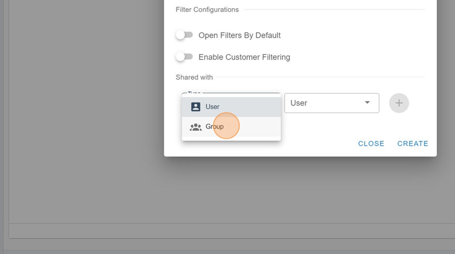
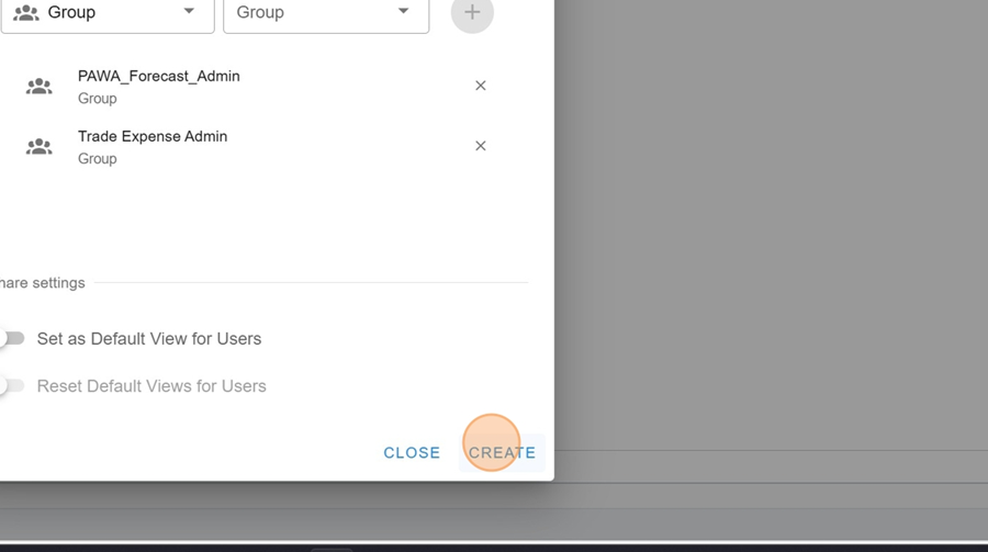
Initial setup > Shared with
You can share the report with certain users or groups.

Click on the option you want in the dropdown menu, under the Type box
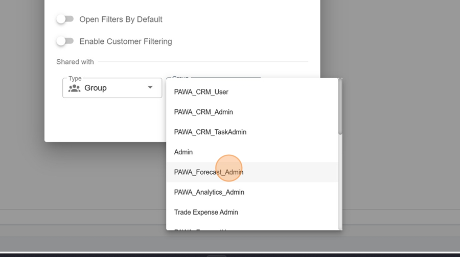
Pick the option that works for you in the second dropdown menu
Click on the + icon all the way to the right. You can repeat these last steps if you want to add more than one user or more than one group
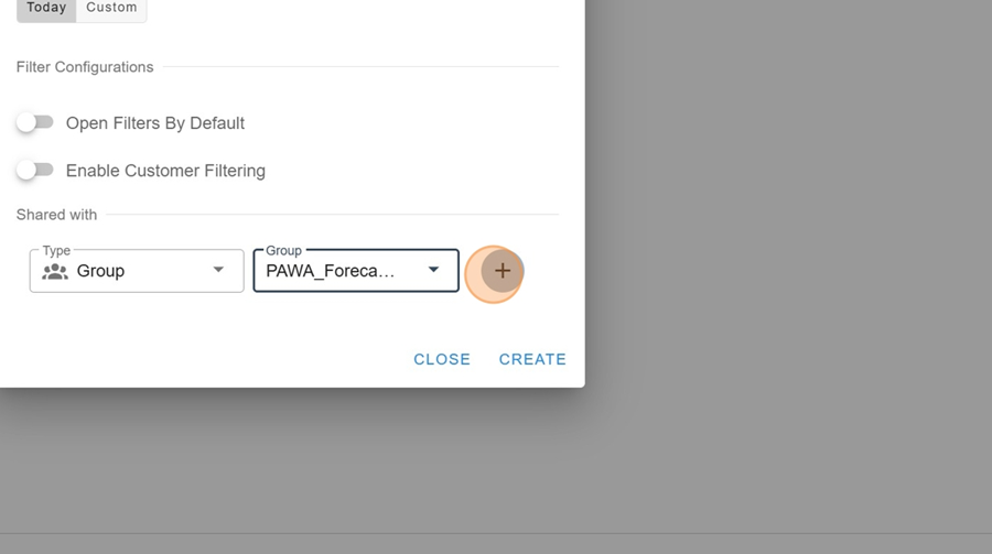
Once you're happy with the setup, click CREATE in the bottom right
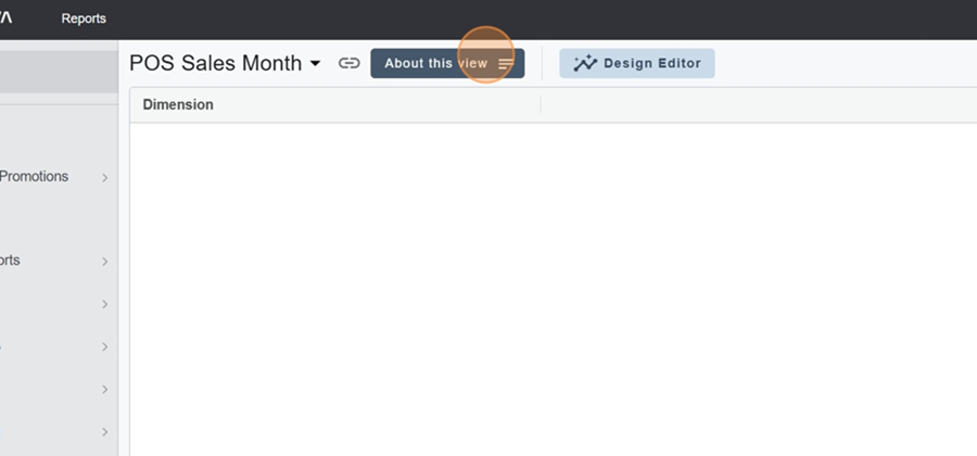
It's possible to write a quick summary description for the report.
Click the About This View button at the top left
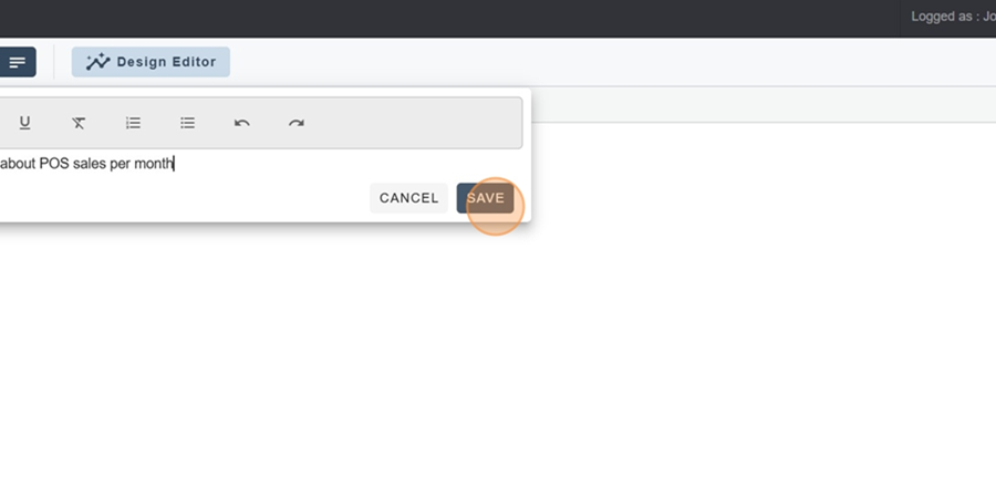
Add your report description and click Save at the bottom right
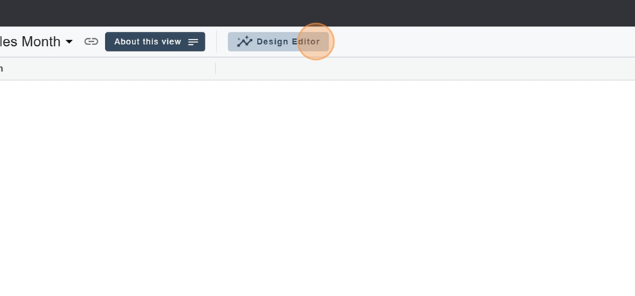
Now let's look at the report setup options that pop up when you click the Design Editor button at the top of the screen.
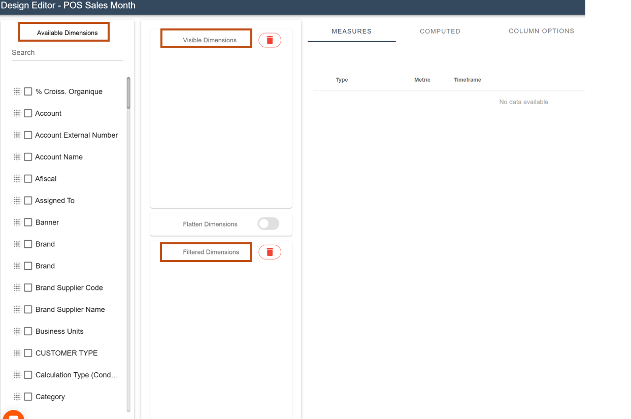
The left section has 3 main parts:
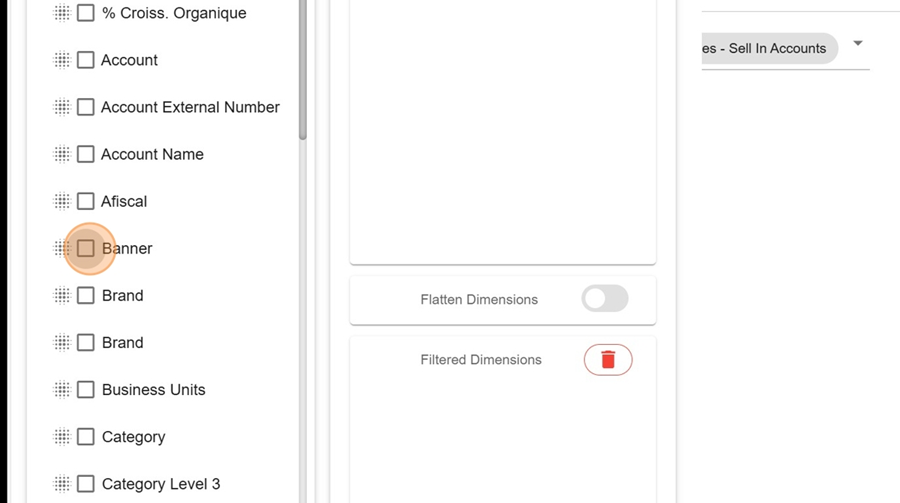
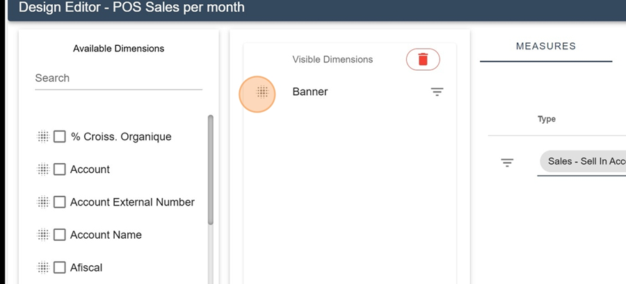
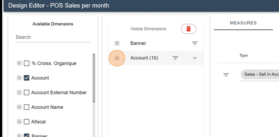
Available dimensions: these are the dimensions available for the report. To put them in one of the other two boxes, click and hold on your chosen dimension and drag it to the section you want
Visible dimensions: these are the dimensions that show up in the report
Filtered dimensions: these are the filters in the report
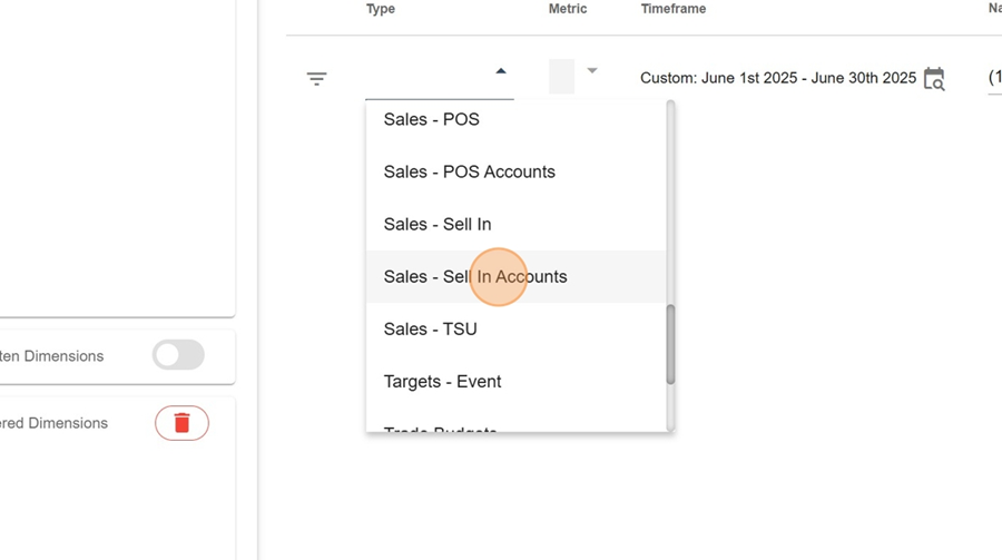
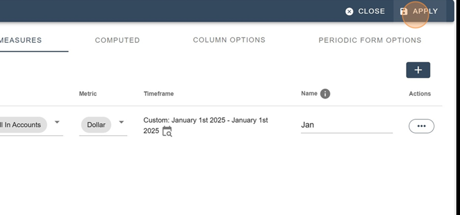
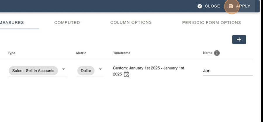
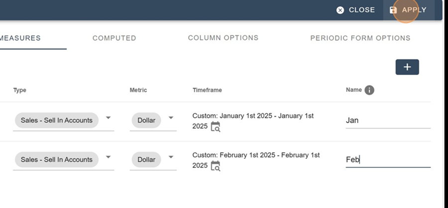
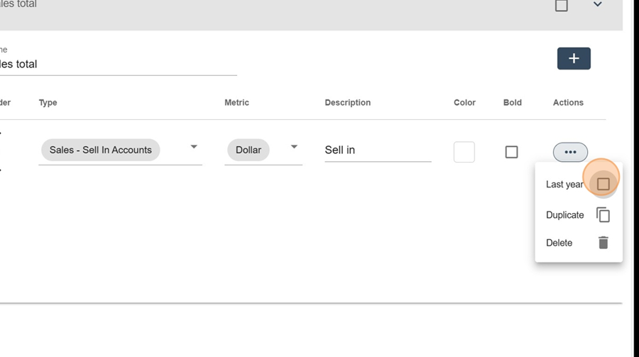
To add a measure, first click the + button all the way on the right
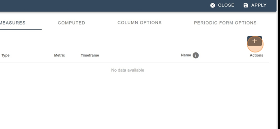
Pick an option from the ones that pop up in the dropdown under the Type
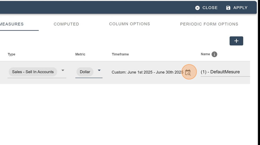
Set up the other metric parameters (Metric, Timeframe, Name)
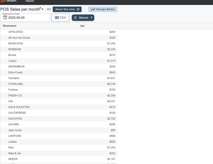
Then pick the visible dimensions you want (in the left section). For example; Banner
Move it into the box made for it
Click APPLY at the top right
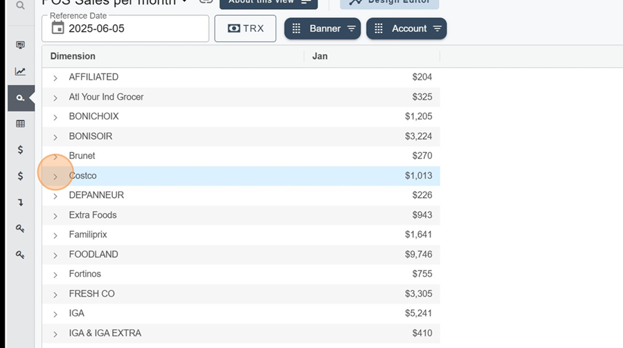
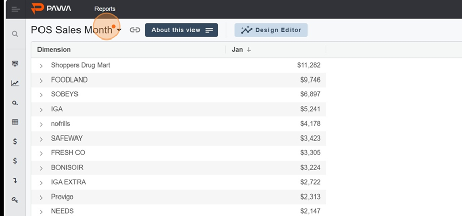
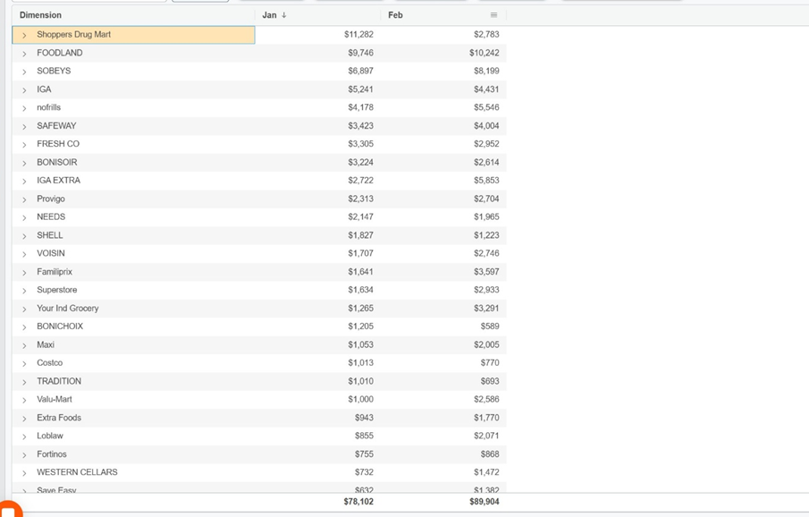
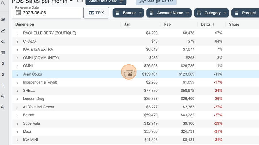
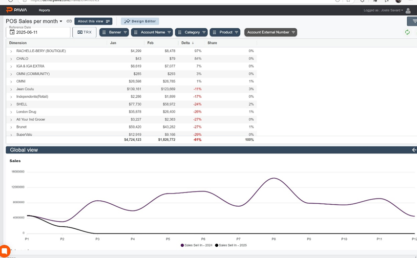
That way you can check out the content connected to your selections (For example here, we can see January's sales by banner)
You can add several dimensions at once by repeating the same steps and clicking APPLY
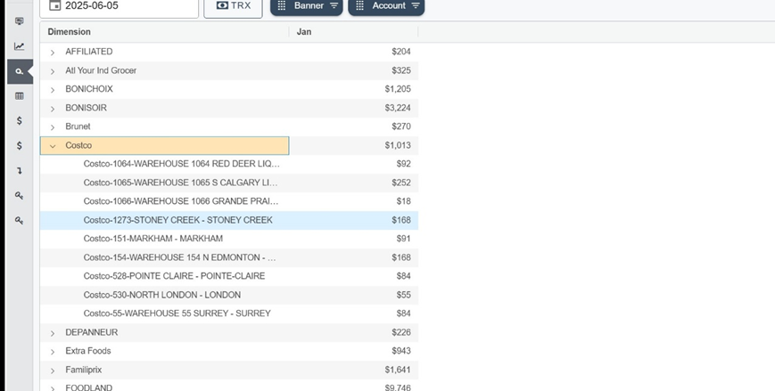
You can then see the new dimensions by clicking the > to the left of the chosen category. For example here, by clicking the > next to the Costco banner
You’ll see all the accounts linked to it show up
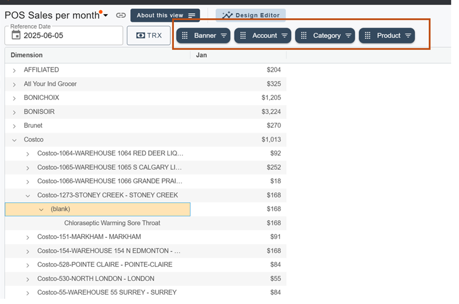
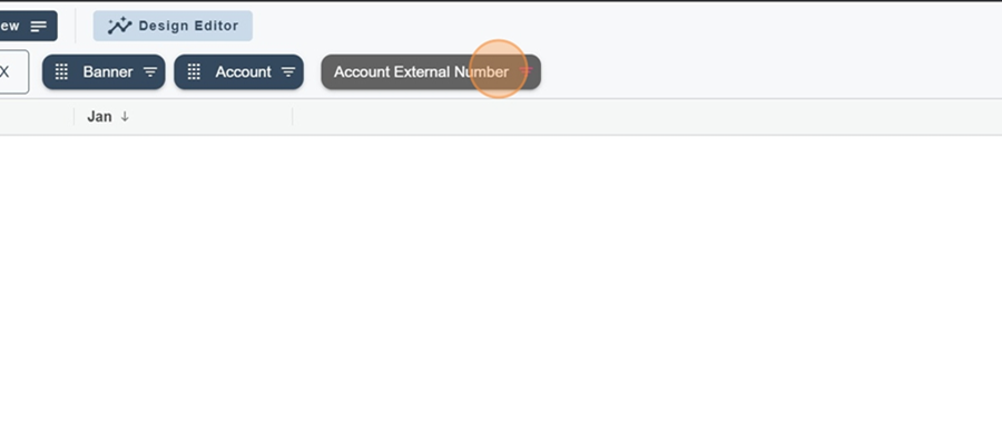
The selected dimensions will show at the top of the screen, in order
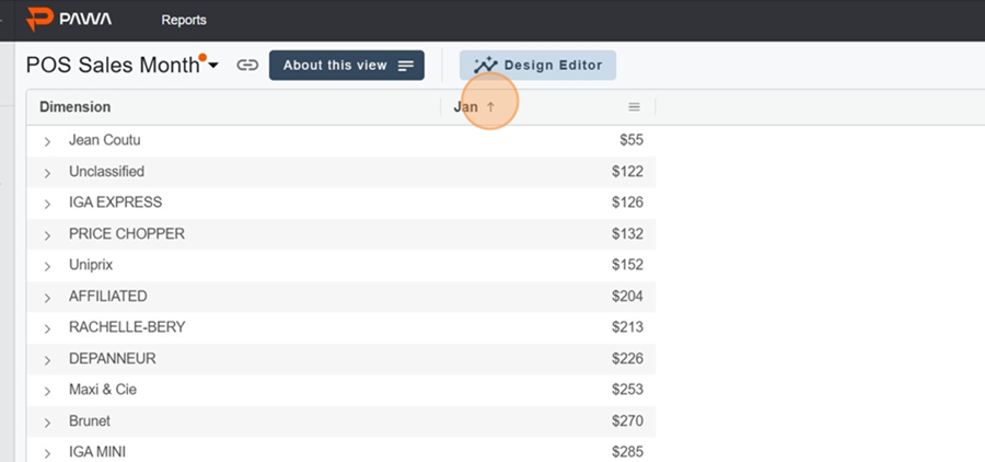
You can change the sorting order (biggest to smallest or the other way around) by clicking on the measure’s name. For example, here if you click on Jan
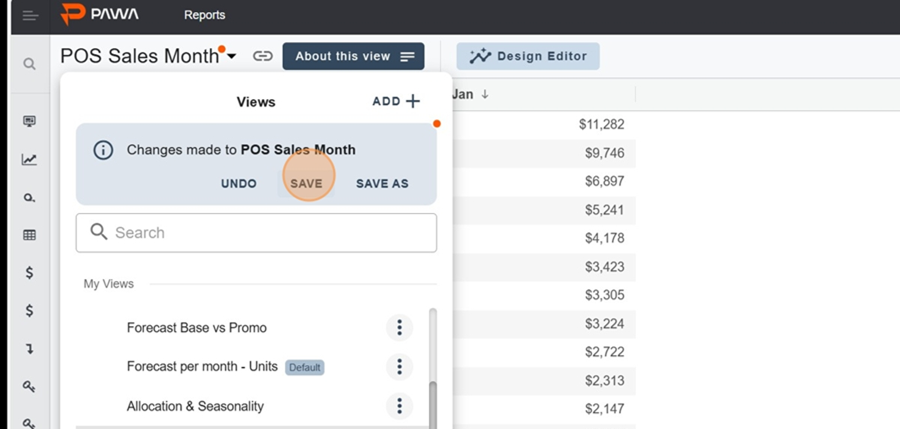
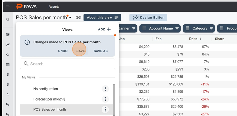
A little red dot will show up to the right of the title every time you make a change, reminding you that you’ve got unsaved changes.
To save, just click on the title and then hit the SAVE button
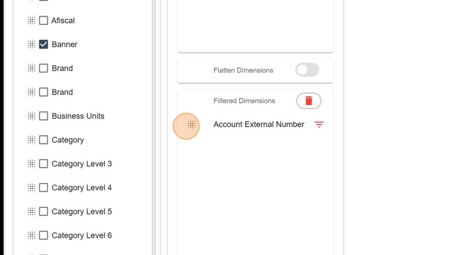
You can also add filters that aren’t visible in the dimensions at first glance. You’ll only see them if you click right on the filter.
For example, here’s how you’d check the Account external number for a certain dimension;
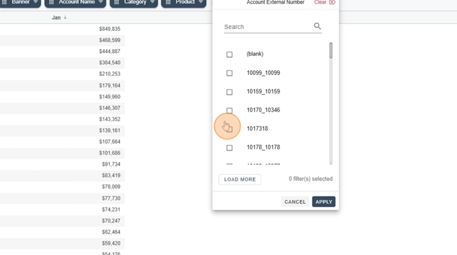
Go to the Design Editor and drag the filter you want into the Filtered Dimensions
Click the Apply button at the top right
Click on the filter (here, Account external number)
Pick the product you want from the dropdown and click Apply to see the filtered info
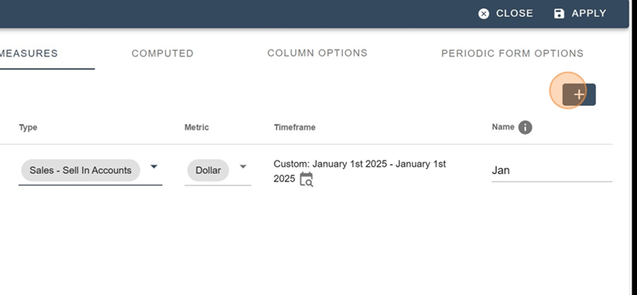
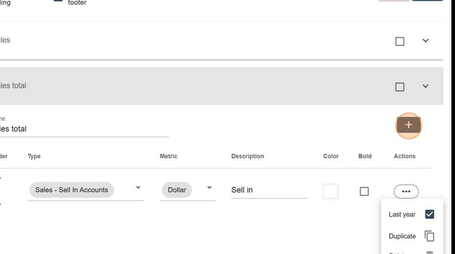
You can add more measures to the report by repeating the steps in the above section called Measure configuration
For example, here we want to see the same measure (Sale-Sell In Accounts), but this time for February. So, we'll add a new measure like explained before.
So, fill in the parameters and click apply at the top right
The sales totals for the 2 months will be displayed
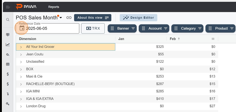
So you can change the reference date just by clicking the calendar at the top left.
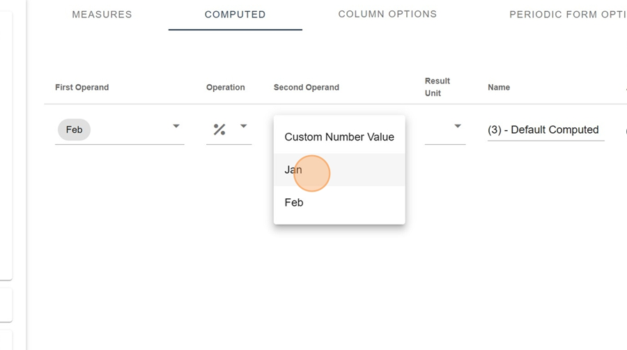
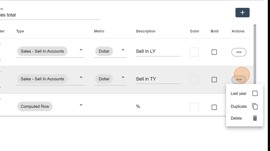
The Computed section lets you do calculations. For example, if you want to calculate the growth percentage between the first and second measurement.
Click the + at the top right
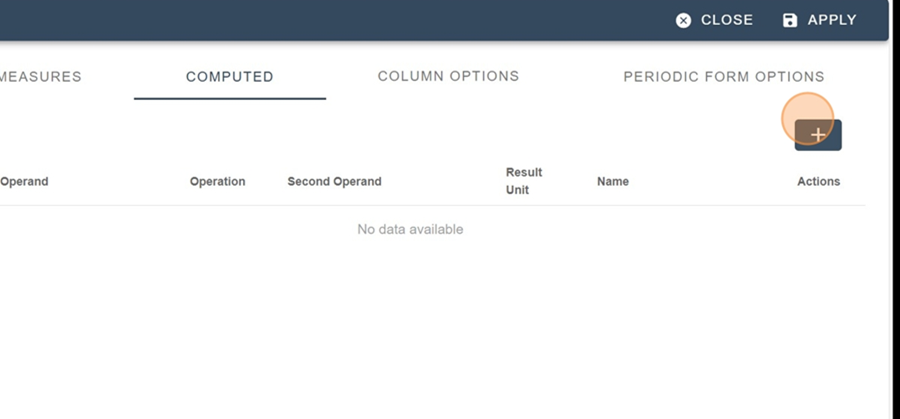
Fill in the settings
Name the column
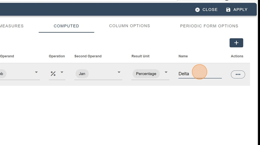
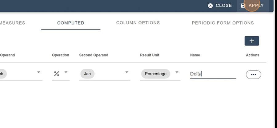
Click apply to check
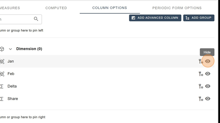
This section lets you hide or show certain columns, just by clicking the eye icon on the right side of the category.
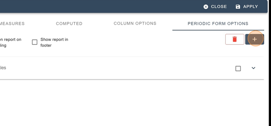
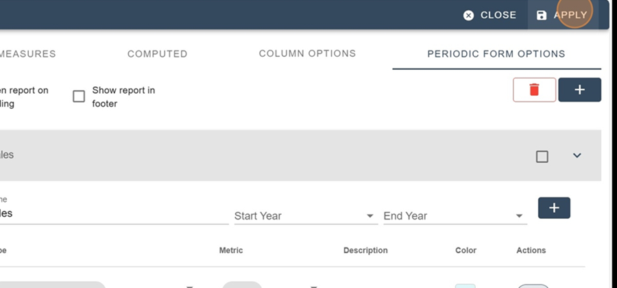
This section lets you display 3 periodic options:
Charts
Tables
Advanced tables
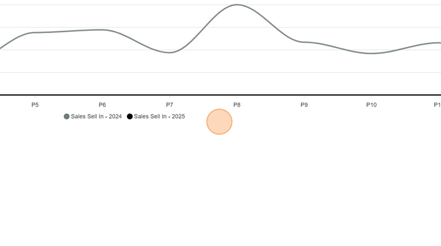
The line chart lets you see how the data changes over a certain measure.
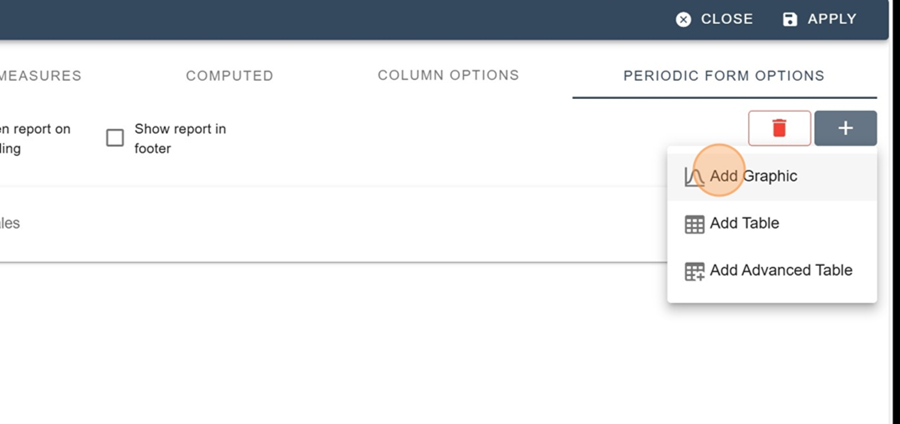
To add a chart, first click on the + icon at the top right
Select the Add Graphic option from the dropdown menu
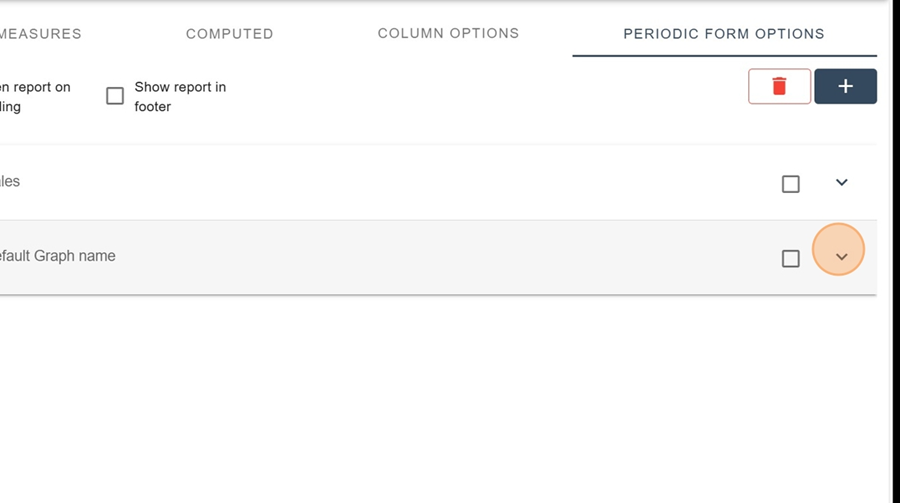
Click the down arrow at the end of the Default Graph name row
For example, if we want to see sales by a certain metric (Sell In Accounts), just start by filling in the parameters (Name, Type, Measure, Description, Color)
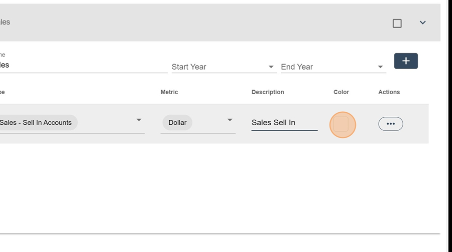
And click Apply, top right
To view the chart, click the chart icon that appears when you hover your mouse over the desired row.
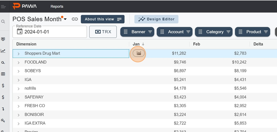
So in this case, you can view your sales over time using the chart
The table lets you see how the data changes by a certain measure in table format.
To add a table, first click the + icon at the top right
Select the Add Table option in the dropdown menu
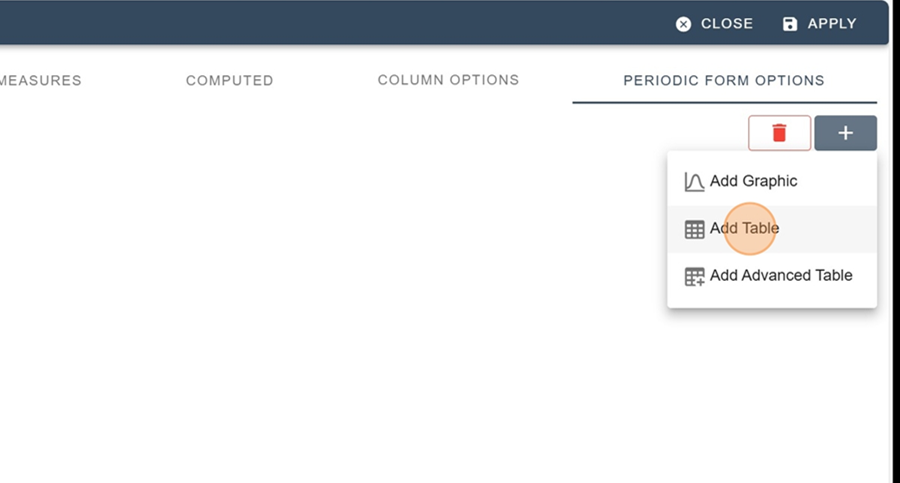
Fill in the settings (Name, Type, Measure, Description, Color)
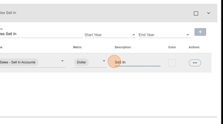
Click Apply, at the top right
To view the chart, click the chart icon that shows up when you hover your mouse over the desired row.
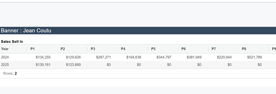
So you’ll be able to see in the table how the numbers are growing (here, month by month) as well as a yearly total
The advanced table lets you watch the data change as a table, and you can show several metrics at once
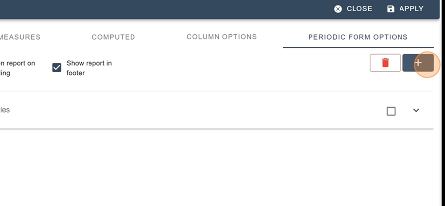
To add an advanced table, first click on the + icon at the top right
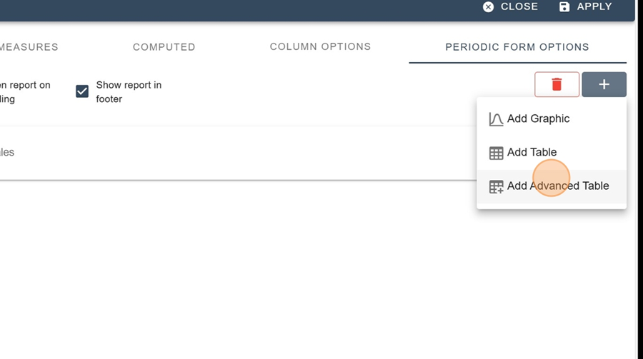
Choose the Add Advanced Table option from the drop-down menu
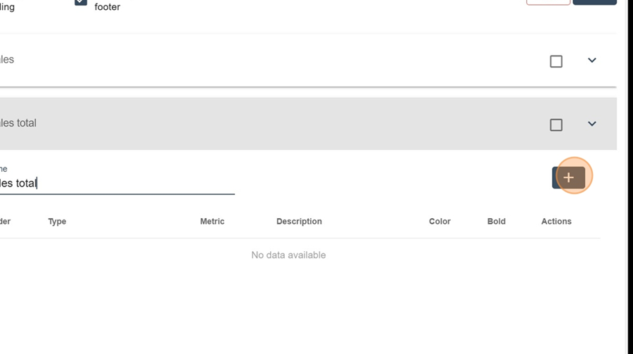
Name your table and click the + to add measures
Fill in the settings (Name, Type, Measure, Description, Color)
Click the + icon at the top right to add a new measure
Fill in the settings again
You can also make calculation columns by selecting the Computed Row option from the dropdown menu under the Type
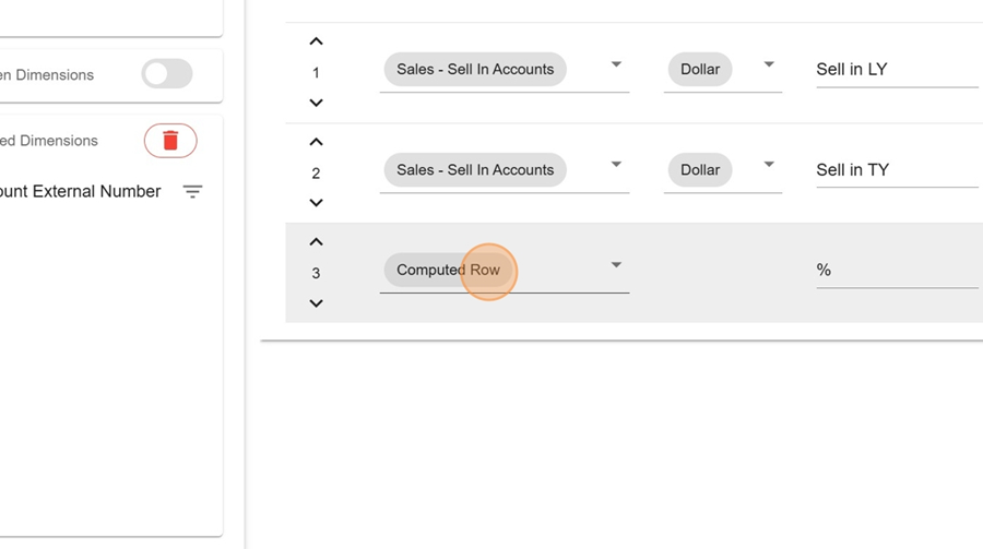
Then pick the measures you want to calculate a ratio for
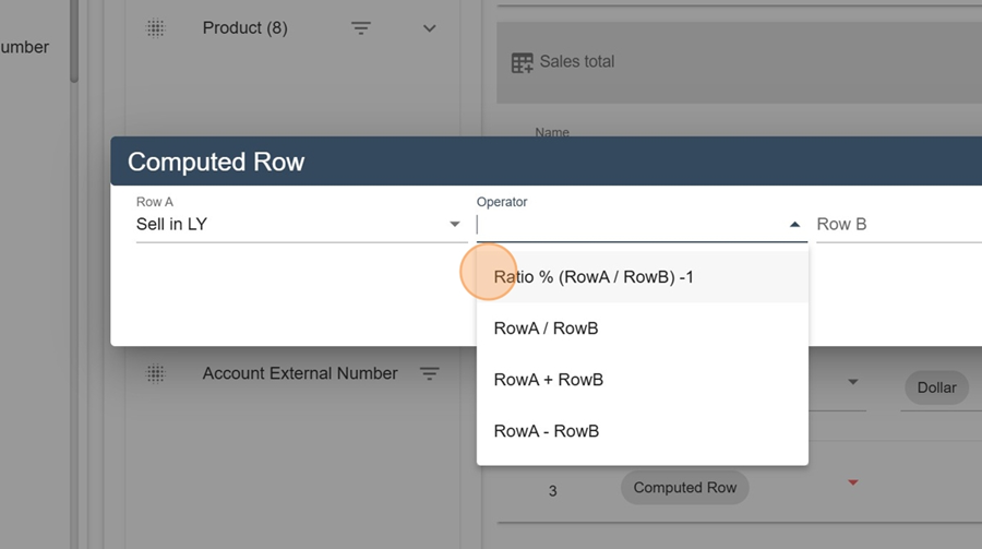
Click on Save
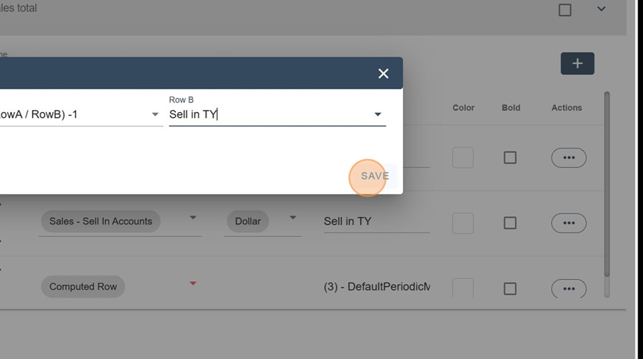
Click Apply, at the top right
So, you can see in the advanced table how the numbers change over time and, in this case, the ratio of the two selected measures
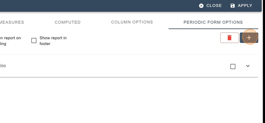
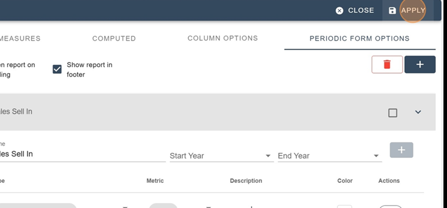
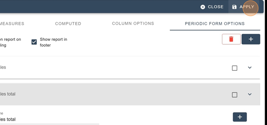
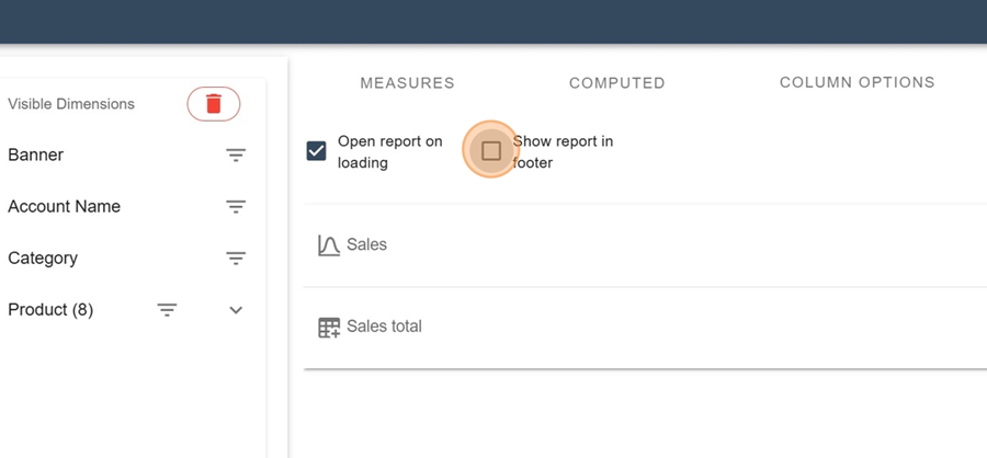
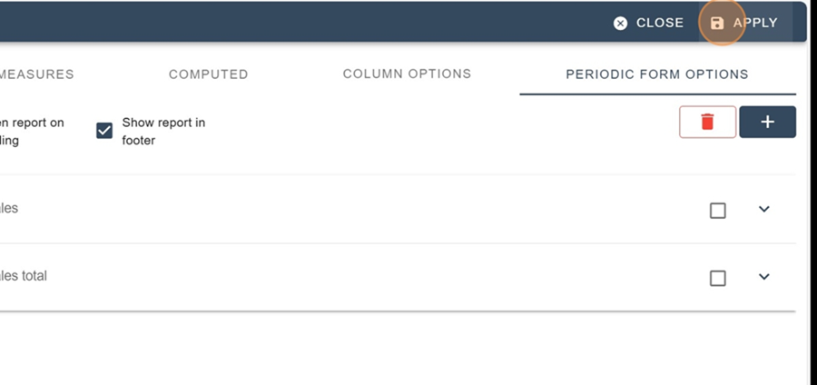
To make periodicals show up at the bottom of the screen when checking out the report, go to the Design editor and check both boxes at the top of the section Periodic Form Options (Open report on loading and Show report in footer)
Click next on apply at the top right
Here's what you should see when you view the report
Save the view by clicking on the title at the top left and on the SAVE button
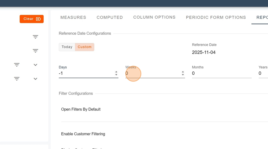
This tab allows you to change the reference date.
To change the date, select the Custom option under the Reference Date Configuration section.
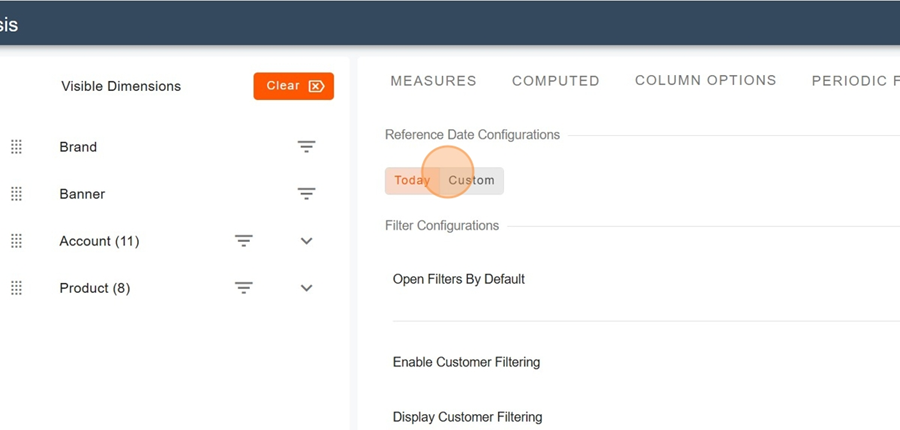
Then, make the desired changes and click Apply in the top right corner. You’ll notice that the reference date will automatically update as you make modifications.
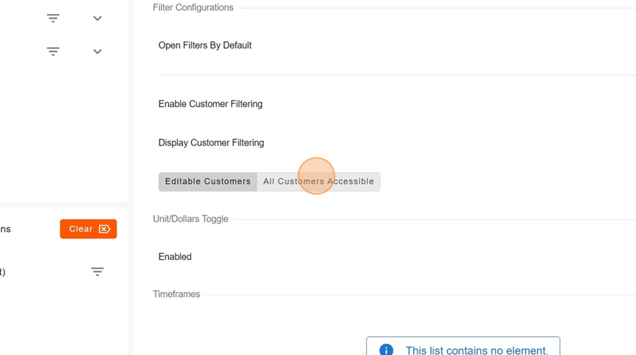
To enable or disable filters, flatten dimensions, or switch units, simply toggle the button located on the far right of the chosen action, then click Apply in the top right corner

This option allows you to enable or disable client access.
To activate client filtering, toggle the button on the right of the option and select your preferred configuration. Don’t forget to click Apply.
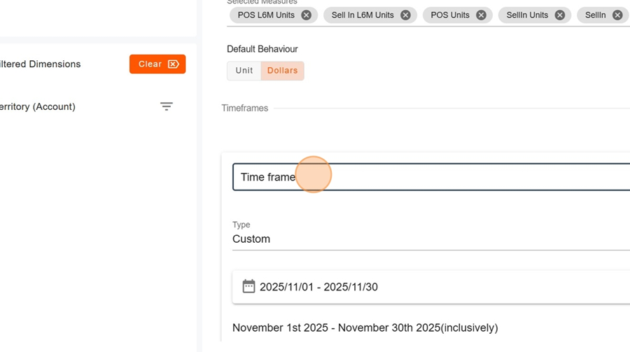
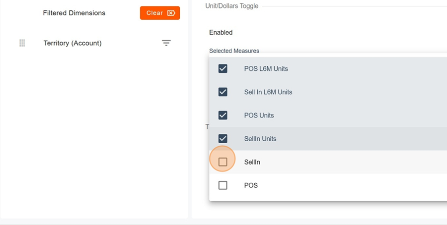
This option allows you to view report units in dollars.
Choose the default behavior.

When you enable this feature, you can then select which metric you want to display in dollars. Note that the list of metrics applies both to the Measures section and to those in the Periodic Form. Don’t forget to click Apply in the top right corner.
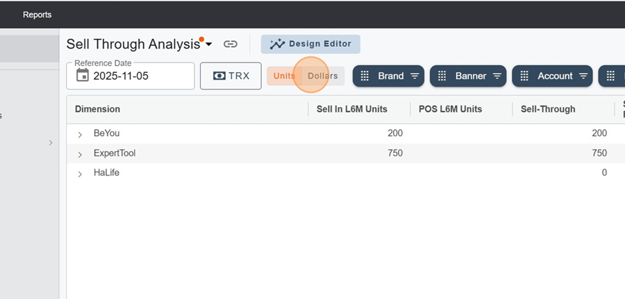
A new option will then appear in the report’s filter section, allowing you to switch between units and dollars.
It is possible to create custom time ranges.
Name your time range and configure it as desired, making sure to click Apply when finished.