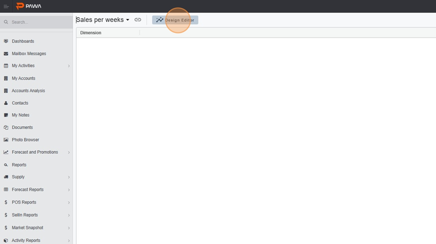
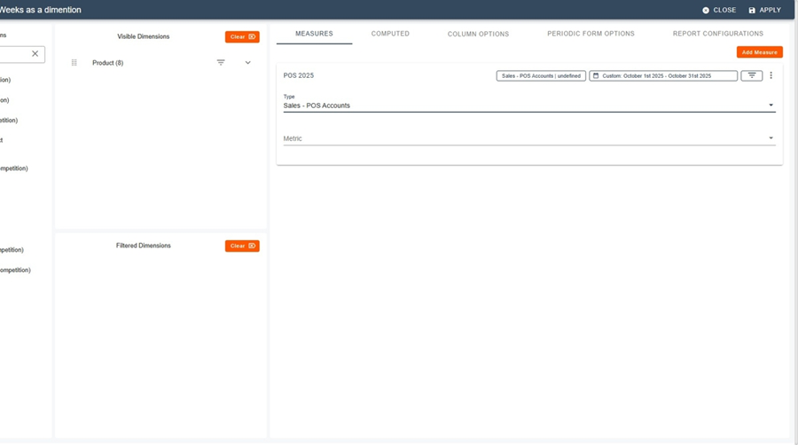
Navigate to the Metric report and create a new report
Switch to Design editor.
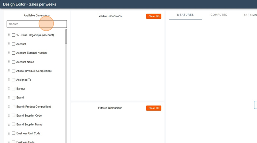
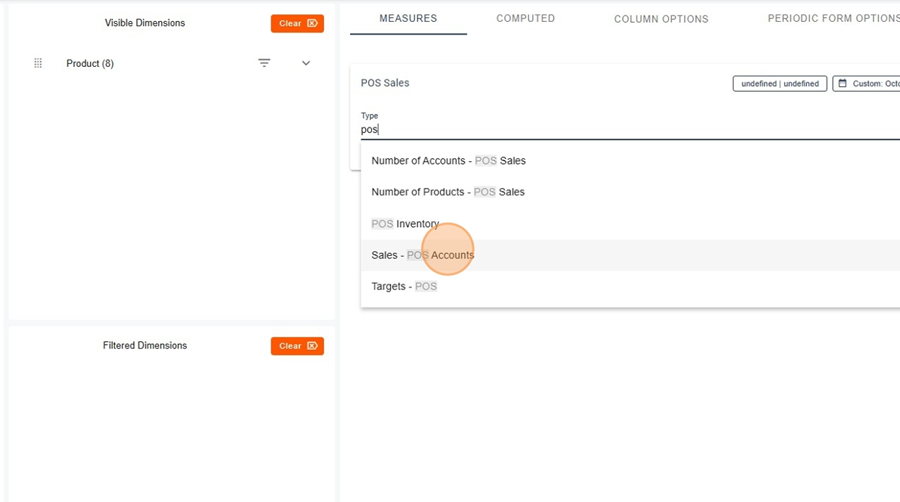
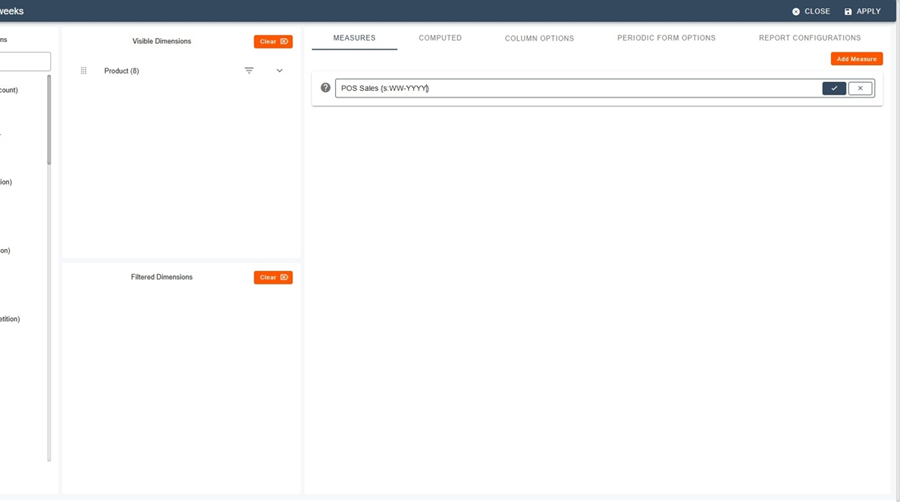
In the dimensions, select Product (e.g., Product).
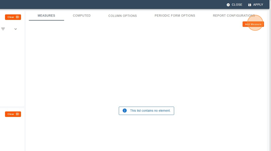
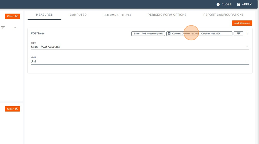
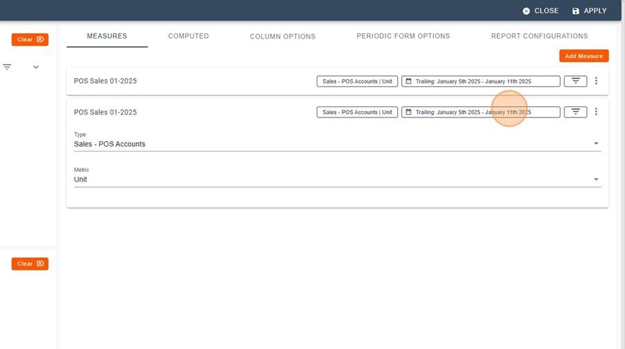
Add the measure: Sales – POS Accounts (unit = Unit).
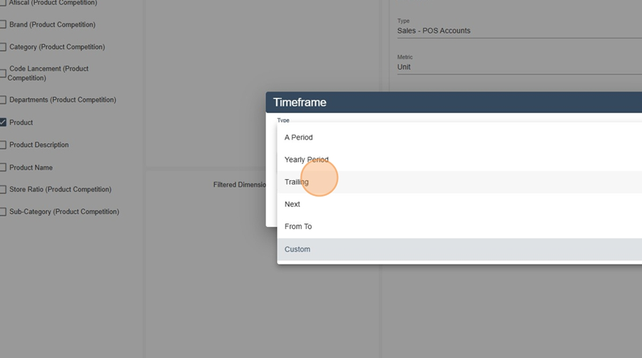
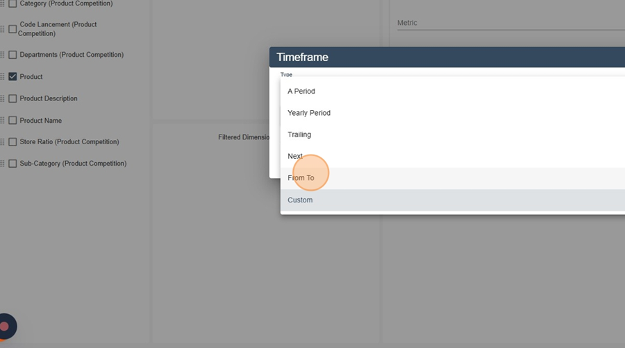
Open Timeframe > select Trailing.
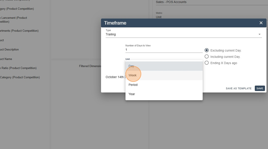
Enter 1 week, then set the end period (e.g.: January 5th 2025 – January 11th 2025).
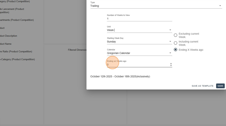
Click Apply to display the POS sales for this week.
Rename the column for a dynamic name (e.g.: POS Sales W{s:WW-YYYY}).
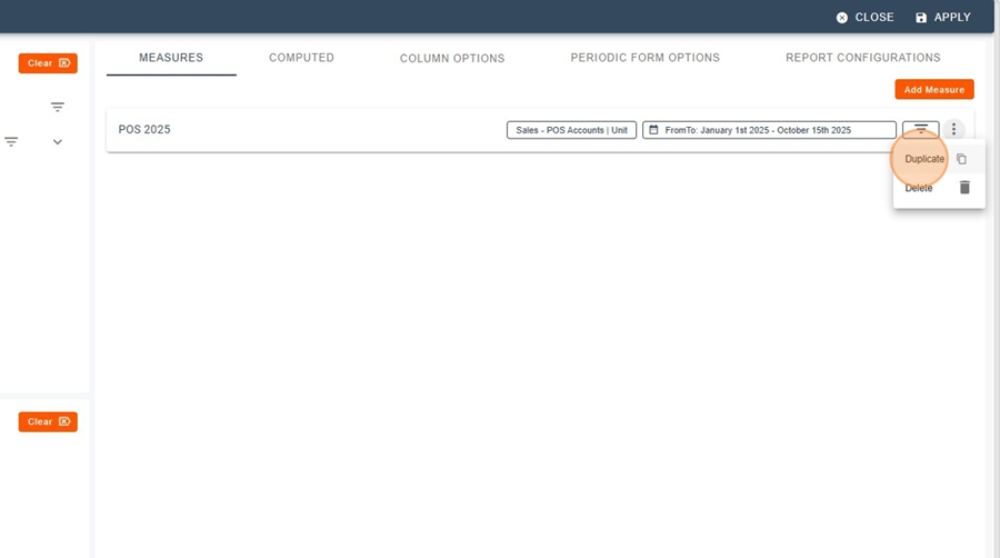
Duplicate the column.
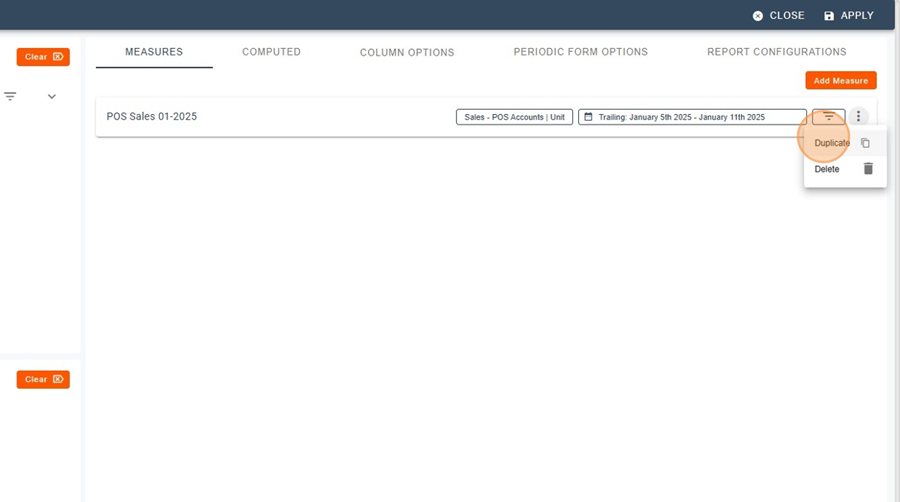
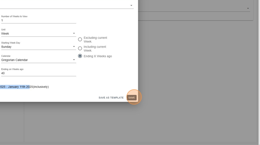
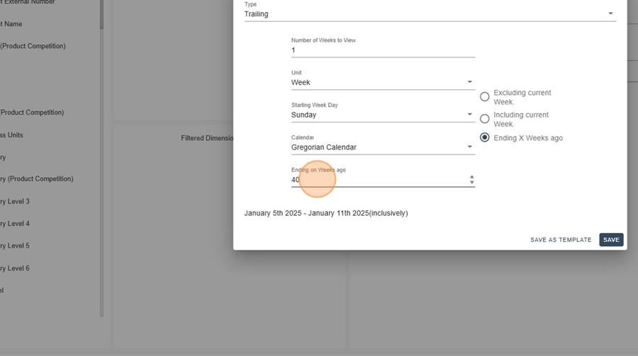
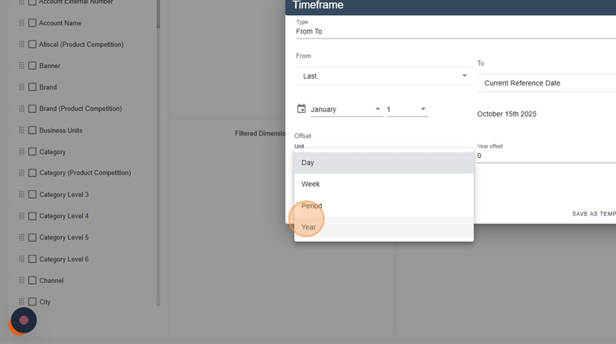
In Timeframe, adjust Ending on → Weeks ago (e.g.: 1, 2, 3, …) to select each previous week.
Save after each change and repeat until you have the desired number of weeks (e.g.: first 6, last 52).
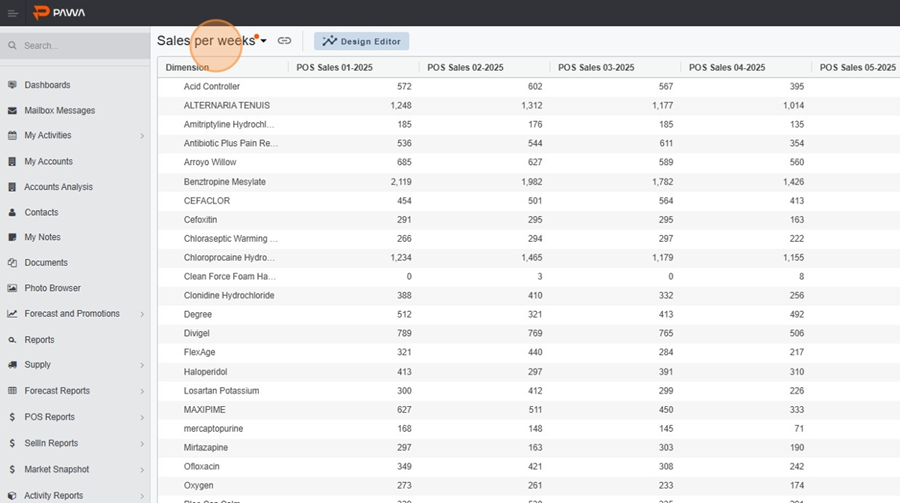
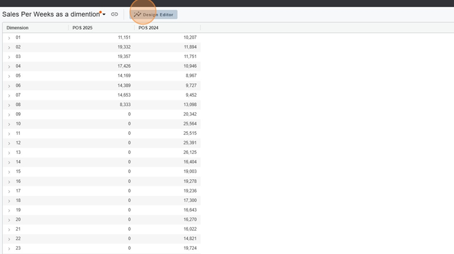
Result: column view, 1 column = 1 week, by Product.
Method 2 - Report with the “Week” dimension + YoY comparison
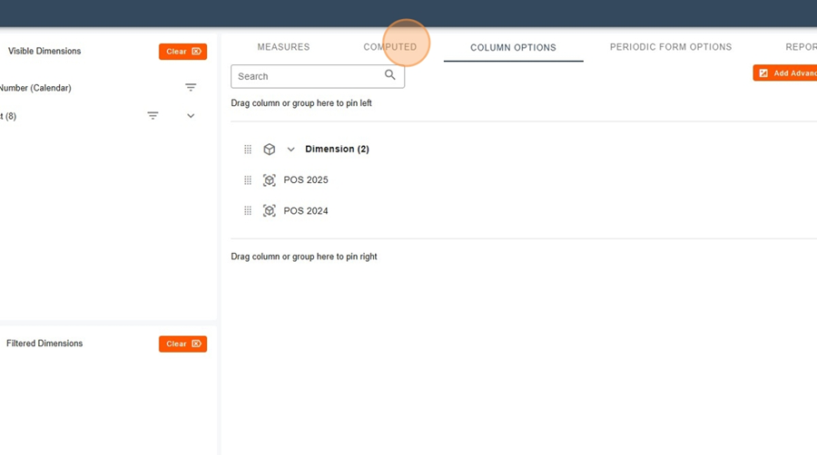
Stay in Design editor with Product selected.
Add the measure : Sales – POS Accounts (Unit).
Timeframe : select From To (end = Current Reference Date).
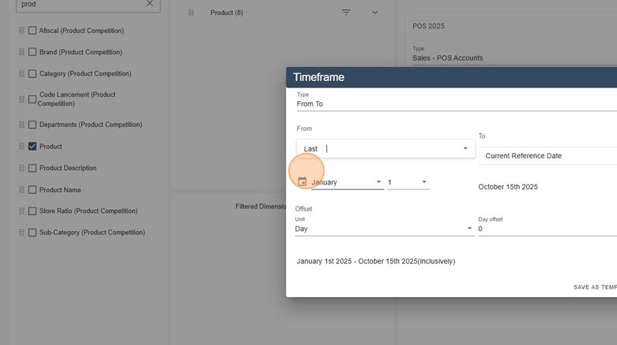
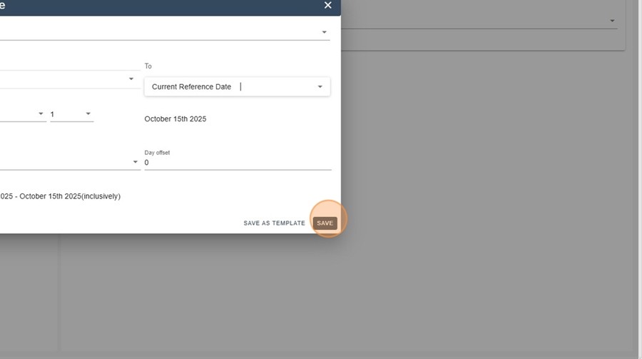
Click Apply : you will obtain the total per product (over 52 weeks).
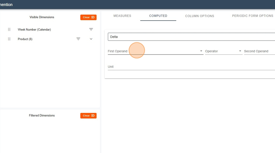
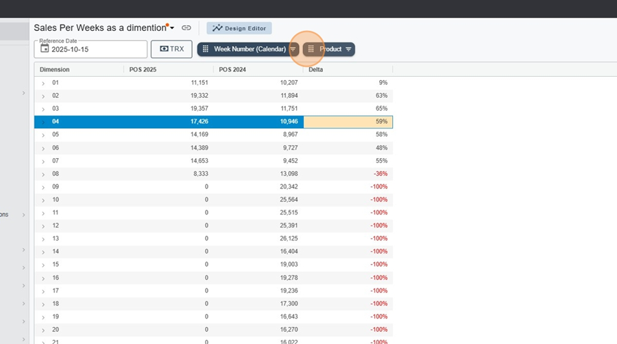
Add the dimension Week Number (drop it into the rows).
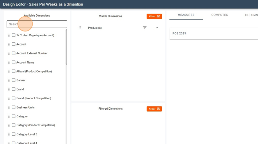
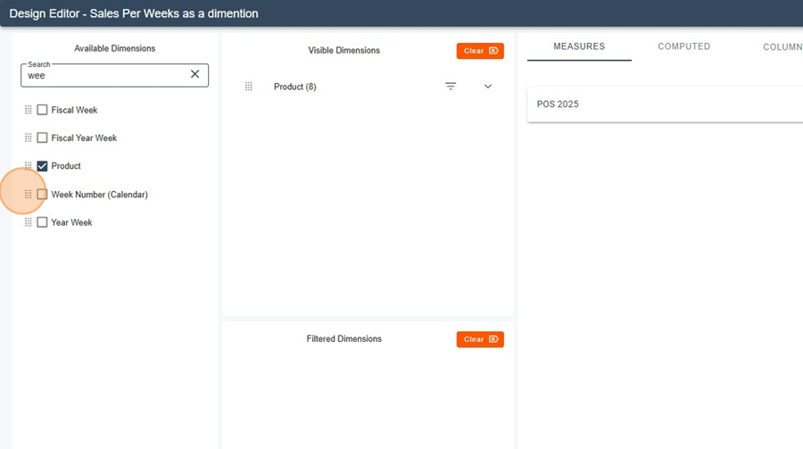
Verify that the aggregation displays one line per week (W01…W52) under each Product.
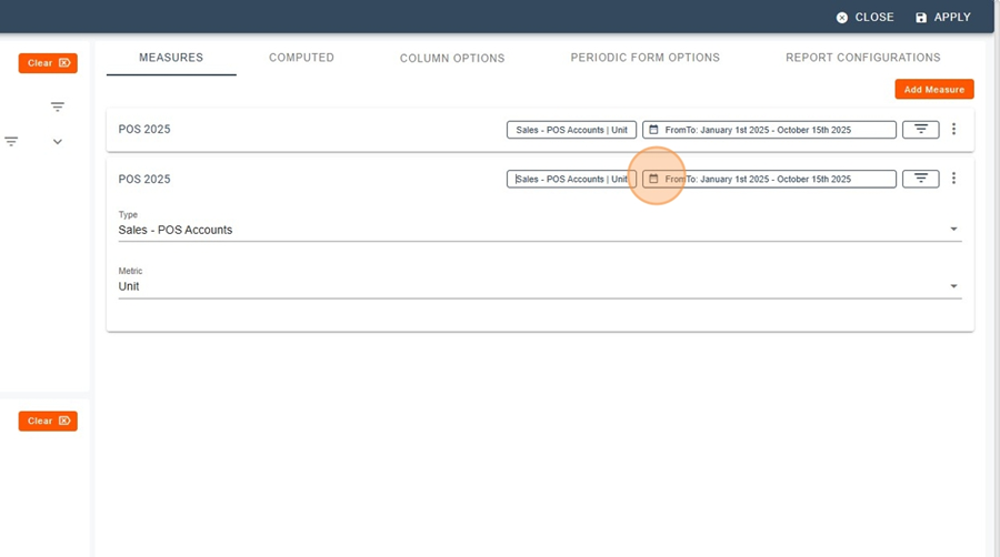
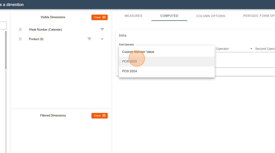
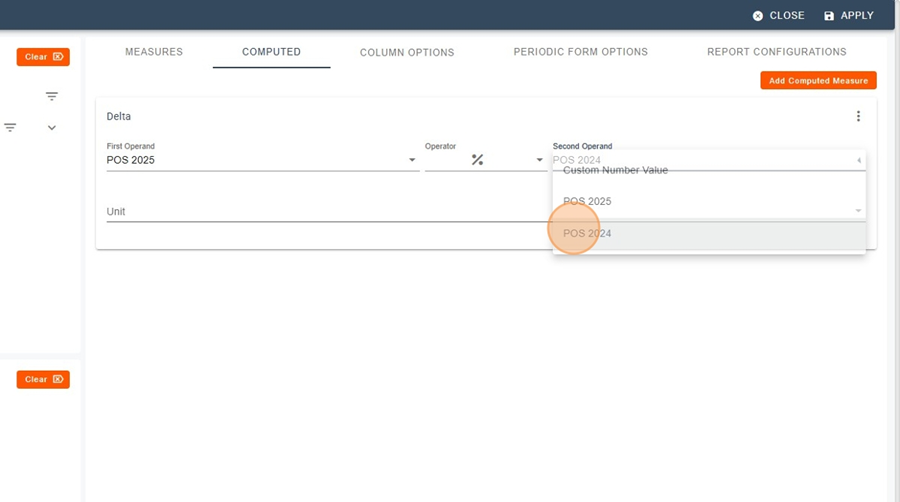
Duplicate the measure.
Measure A = This Year (POS {s:YYYY}) : retain From TO on the current reference date.
Measure B = Last Year (POS {s:YYYY}) : same window but shifted by 1 year (or use the “previous year” option, depending on your environment).
You now have two columns : TY and LY, by Week Number and Product.
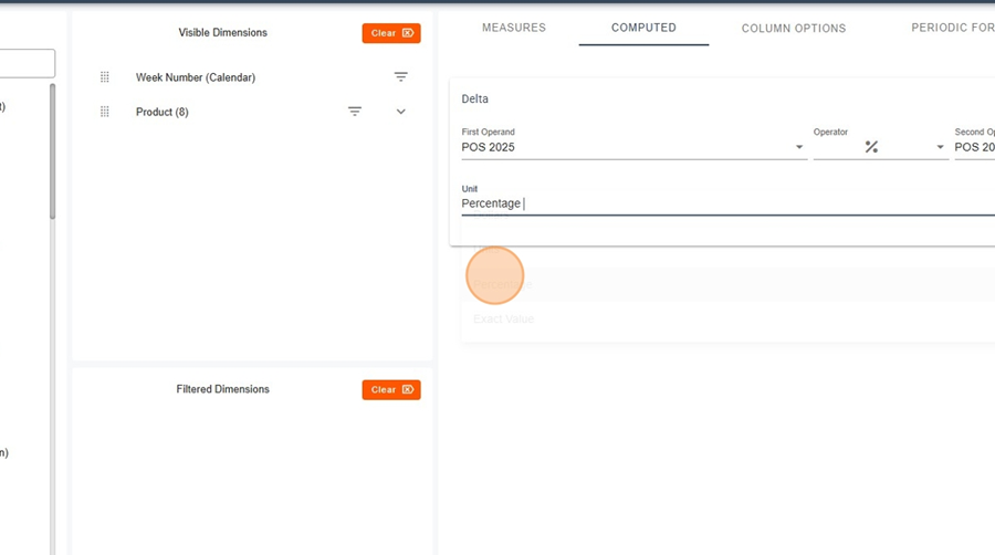
Calculated measure %Δ : %Δ = (TY − LY) / LY.
Display TY | LY | Delta | %Δ for each Week Number and Product.
Analysis example: identification of weeks with growth (e.g.: +9%, +63%) vs decline.

It is possible to compare the same data point over a long period of time.
For example, let us assume that we want to analyze a product using two measures (in this case, Unit Sales and Store Accounts).
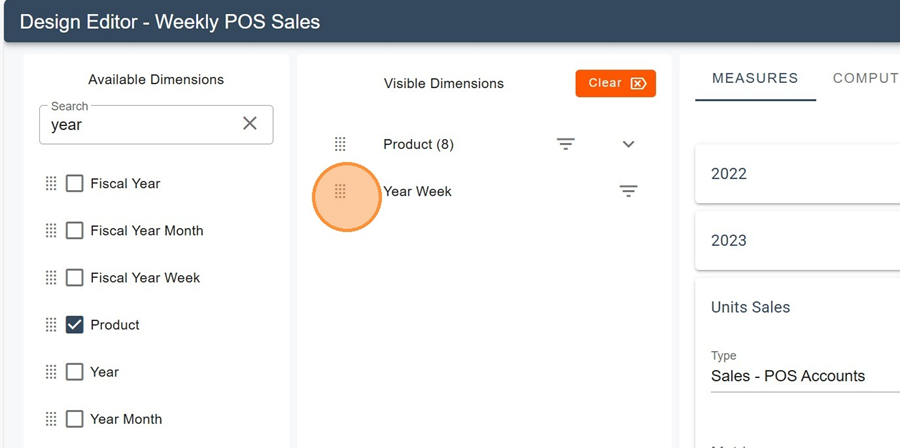
Stay in the Design Editor with Product selected.
Add the Year Week dimension (drag and drop it into the Rows). This dimension allows you to view the data over time.
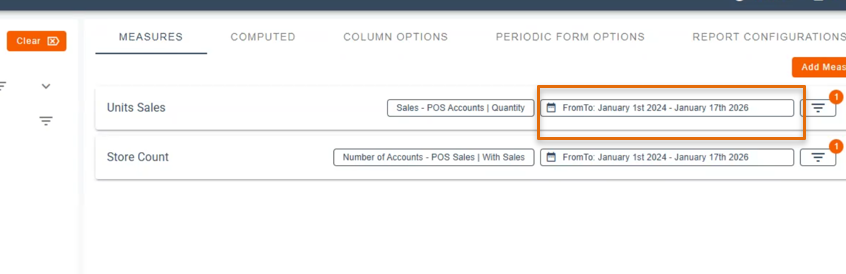
Select the time ranges for each of your measures (there is no limit to the length of the time range; in this example, we are working with more than two years of data).
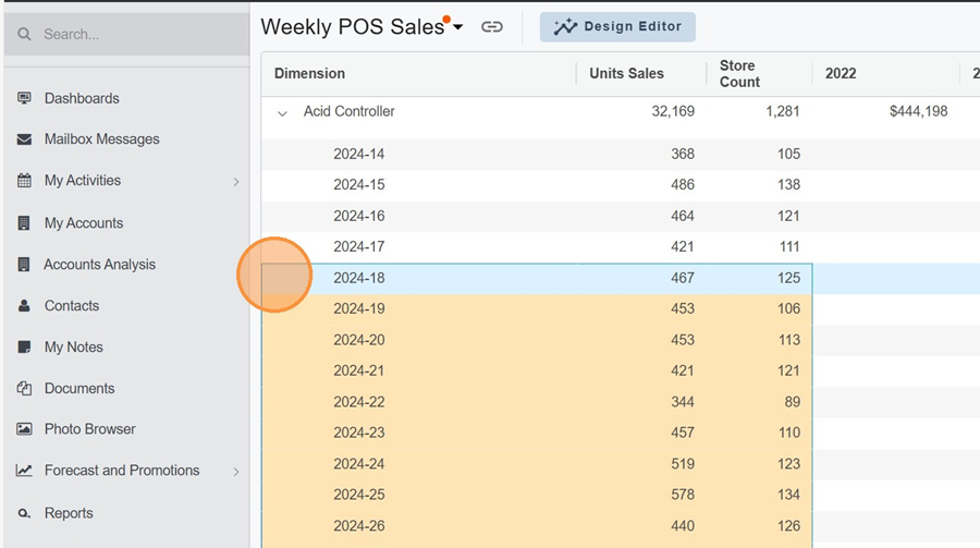
In the report, expand the dimension of your choice to view its evolution over time, week by week.
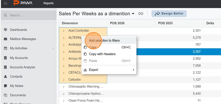
Select the desired dimensions by hovering your cursor over them.
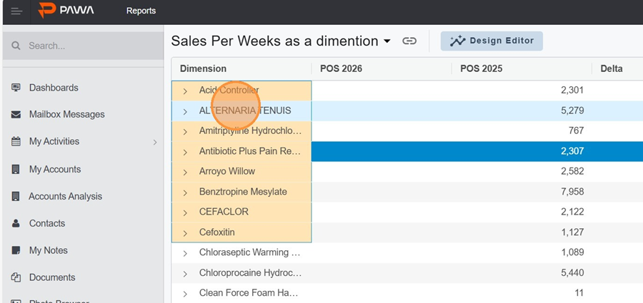
Right-click and select “Add selection to filters.” You will notice that the elements are automatically added to the filter.
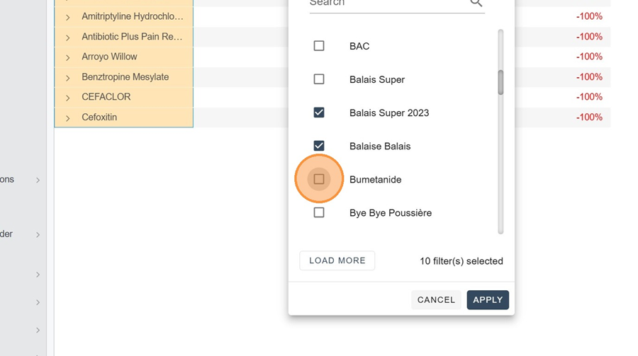
It is also possible to manually select each dimension by checking the boxes in the filter. Don’t forget to click on apply.
A filter can also be applied to clients, following the same principle.
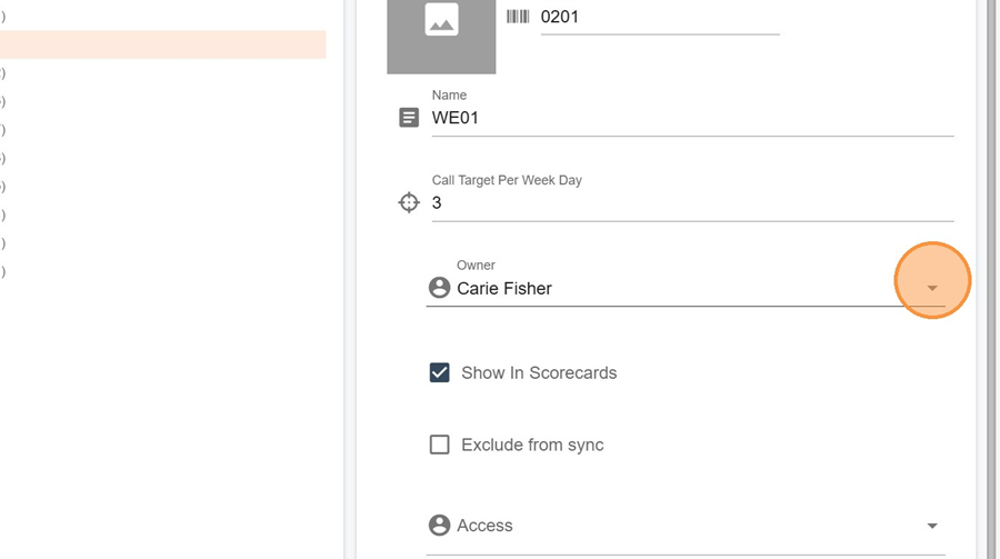
Why can’t I see events in someone else’s calendar?
It’s possible that the selected territory is not assigned to any owner in the Hierarchy section, or that no owner has been defined.
Navigate in Hierarchy > Territory.
Locate the relevant territory. Epand it by clicking the triangle to the left of the territory name.
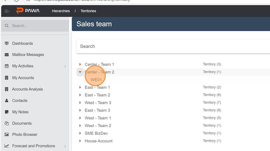
Make sure an owner is assigned. Don’t forget to save.